Human-Centered Design
In the Fall of 2020 I took a human-centered design methods course taught by Professor Kosa Goucher-Lambert within the Jacobs Institute for Design Innovation at UC Berkeley. I had never had so many Aha! moments packed into a semester. For one, half the course consisted on user interviews and defining product requirements, all before dreaming up or building solutions!
Sponsored by Hewlett-Packard and mentored by UX Design Lead Deborani Duttagupta, the project team took on finding a solution for a product opportunity gap (POG) within the Remote Work space. Off course, this space is ripe for innovative solutions due to the sudden onset of the ongoing global pandemic.
The design process focused on bringing human users into the loop, to understand their pain points and their successes while working at home due to the pandemic. As part of the project team, I leveraged human-centered design methods to gather user data, bring a POG into focus, define the product requirements, generate concepts, and finally prototype a final concept for user testing.
At the end the final solution won the Most Innovative award amongst all other projects in the course. Please scroll down to accompany me on my human-centered design journey!
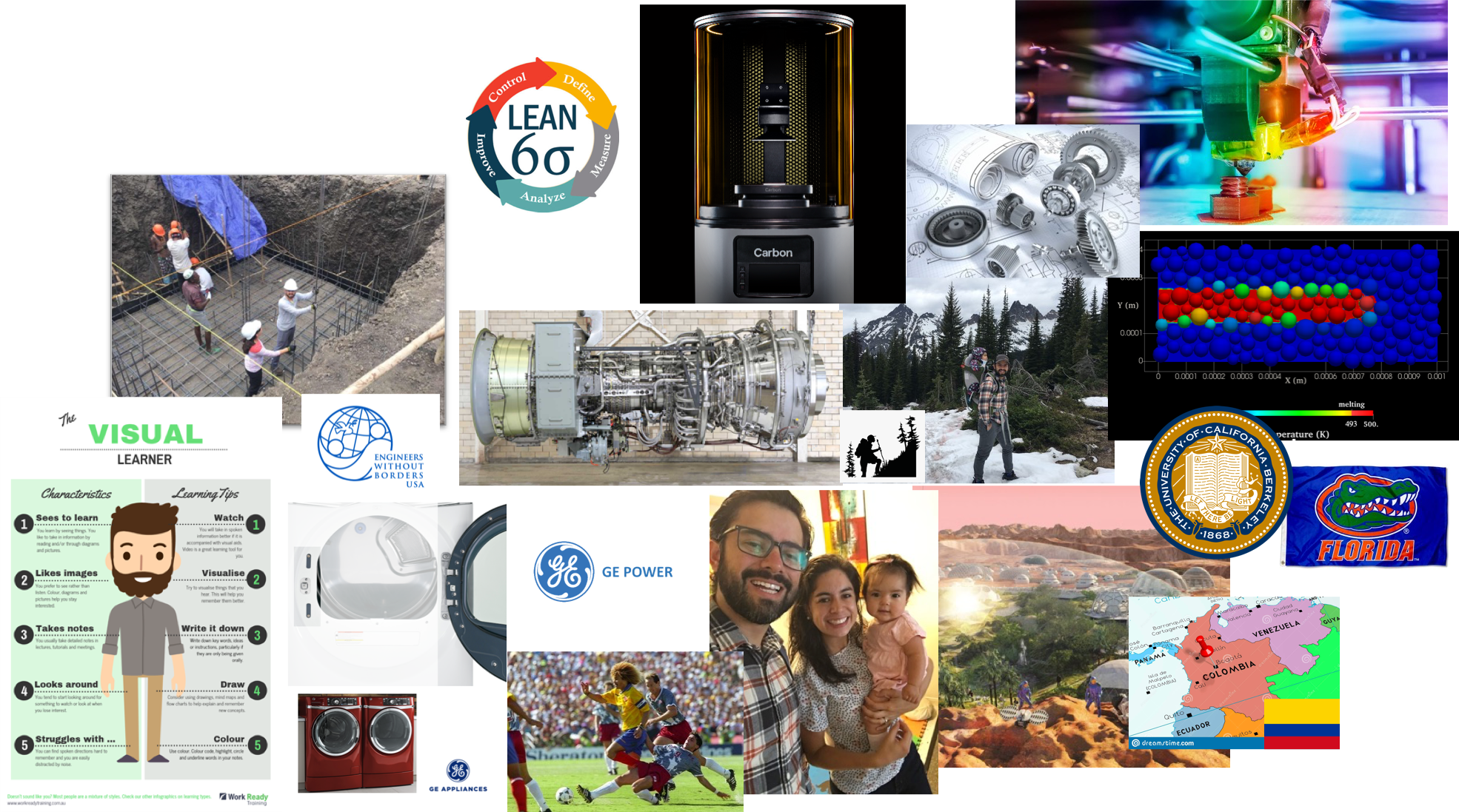
This is me, in a nutshell. I introduced myself to my team members as a husband & dad, born in Bogotá, who enjoys playing fútbol and hike into the unknown, and from time to time volunteers with Engineers Without Borders. I am also a visual learner who is passionate about mechanical design, having designed products in the laundry machine and gas turbine sectors. I hope to enter the advanced manufacturing space after my Ph.D. program, to finding ways to bring innovative products to life. The wonder of one day colonizing Mars keeps me dreaming and dreaming…



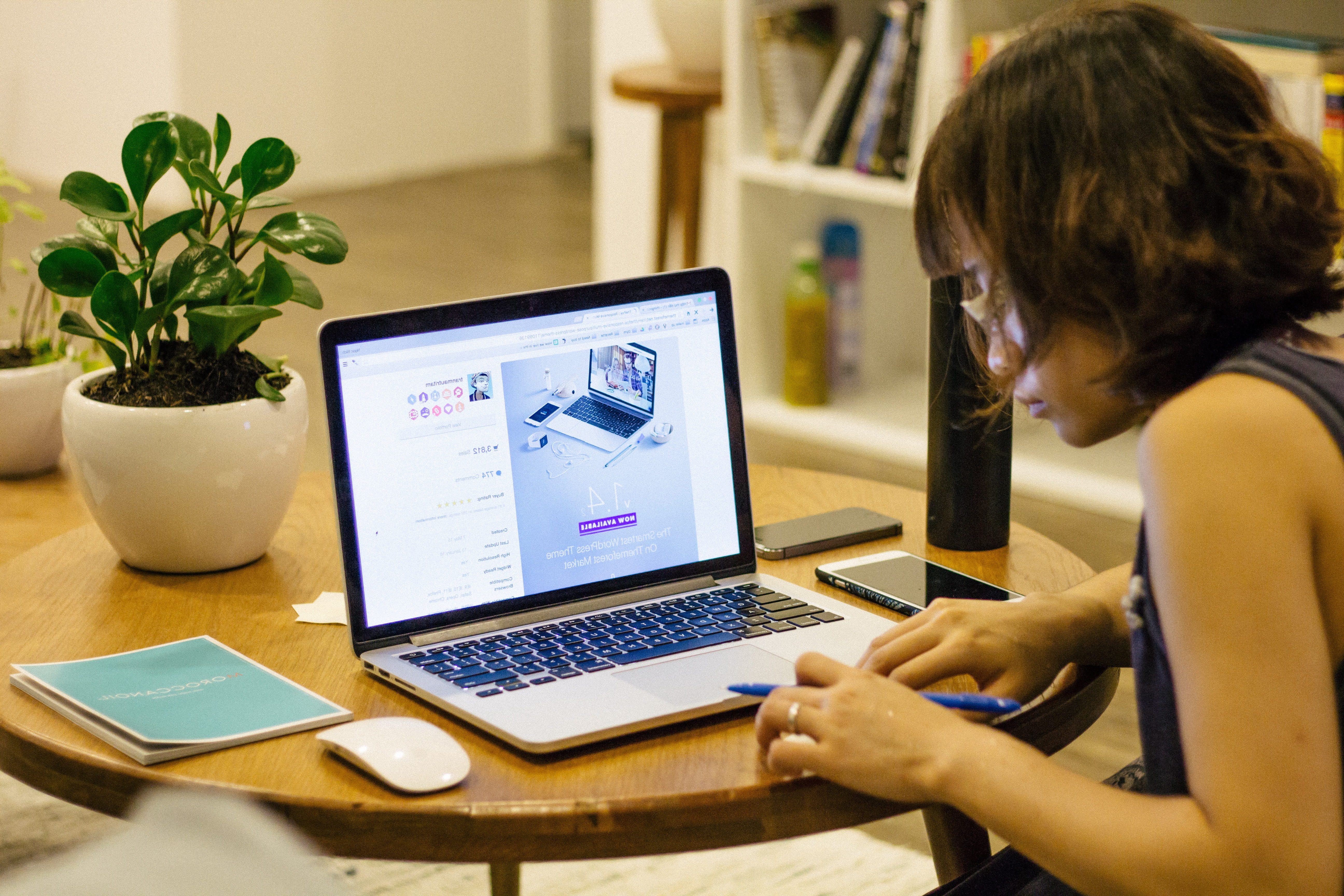
Social isolation due to the COVID-19 pandemic has greatly impacted every facet of everyday life. This historic change has challenged almost every person on Earth, effecting a major exodus of workers from the office into the home. Now, workers must continue performing at their jobs while working from sub-optimal corners of their homes and getting along with a new type co-workers: their family, roommates, and pets.
As a project team, we set out to improve the work-from-home (WFH) experience, but… where to start?
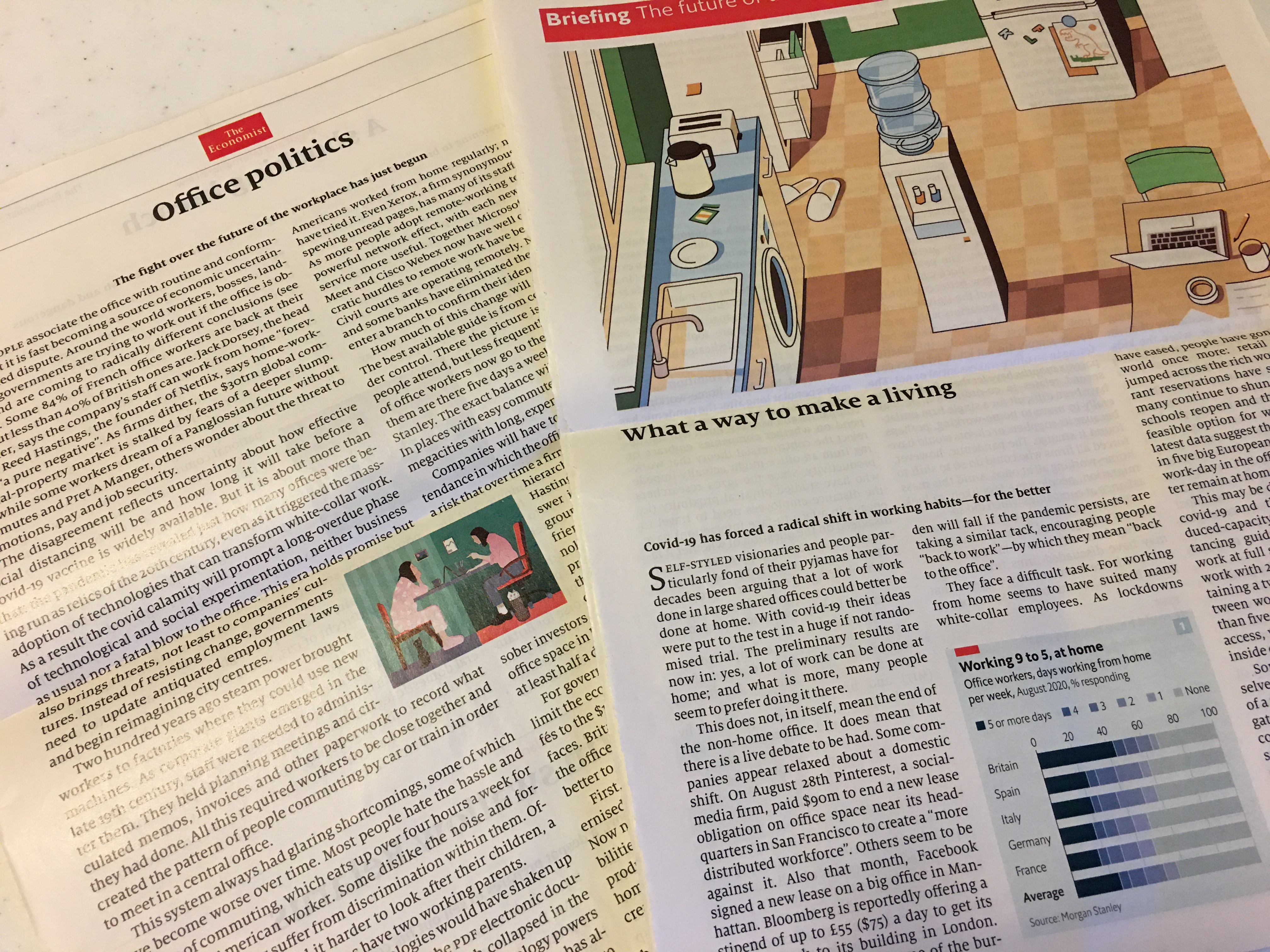
I sat down to brainstorm possible POGs. Two articles on the Sept. 12, 2020 issue of The Economist were my “idea catalysts:”
- “Office Politics – The fight over the future of the workplace has just begun”
- “What a Way to Make a Living – COVID-19 has forced a radical shift in working habits–for the better”
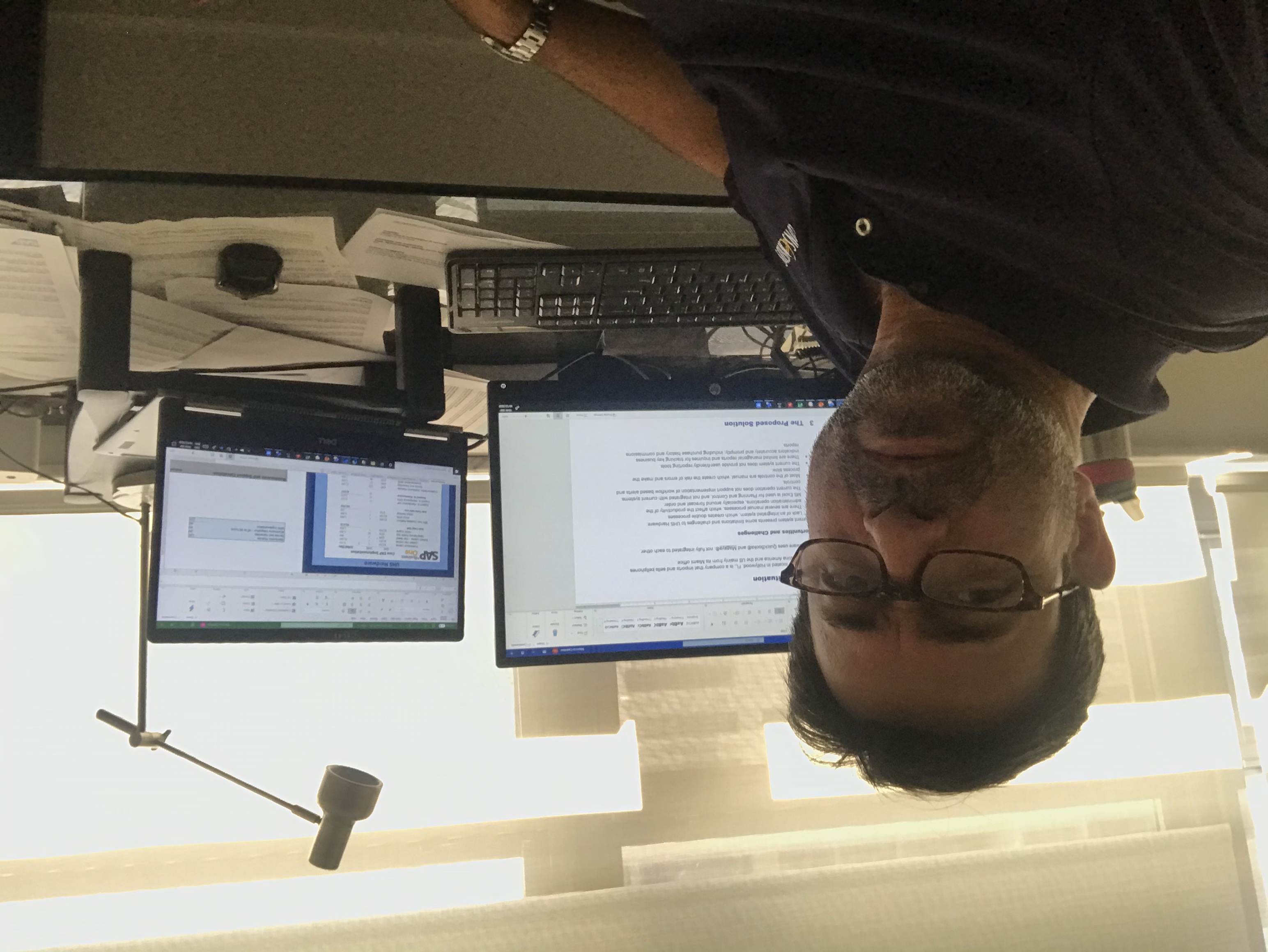
Exploratory user interviews were also very beneficial to generate candidate POGs. I reached out to my uncle in Miami, Mauricio, via a video call to chat about his WFH experience.
“Everything is about work. There are no distractions or any socializing.”
He had great insights around caring for his middle school-aged daughter as she partakes in remote learning and his new “comforts” of moving from an office to a home office:
- Every hour he must make sure she has joined her next class.
- He must prepare lunch for her within a 2-hour break period, which he often forgets to do on time.
- At around 3pm every day he has to help and guide her stay social with her school friends.
- His main desk area is narrow and he wishes he had more space to use an additional monitor.
- He sits on an uncomfortable wooden dining room chair all day.
Catching up with my uncle amidst a social isolation environment was a refreshing experience because I got to learn about his new normal WFH while taking care of his daughter, a new normal that I can relate to.
Personally, empathetic design helped me draw conclusions about my experience working from home. Caring for my young daughter while working has definitely created its own set of new challenges to grow from.
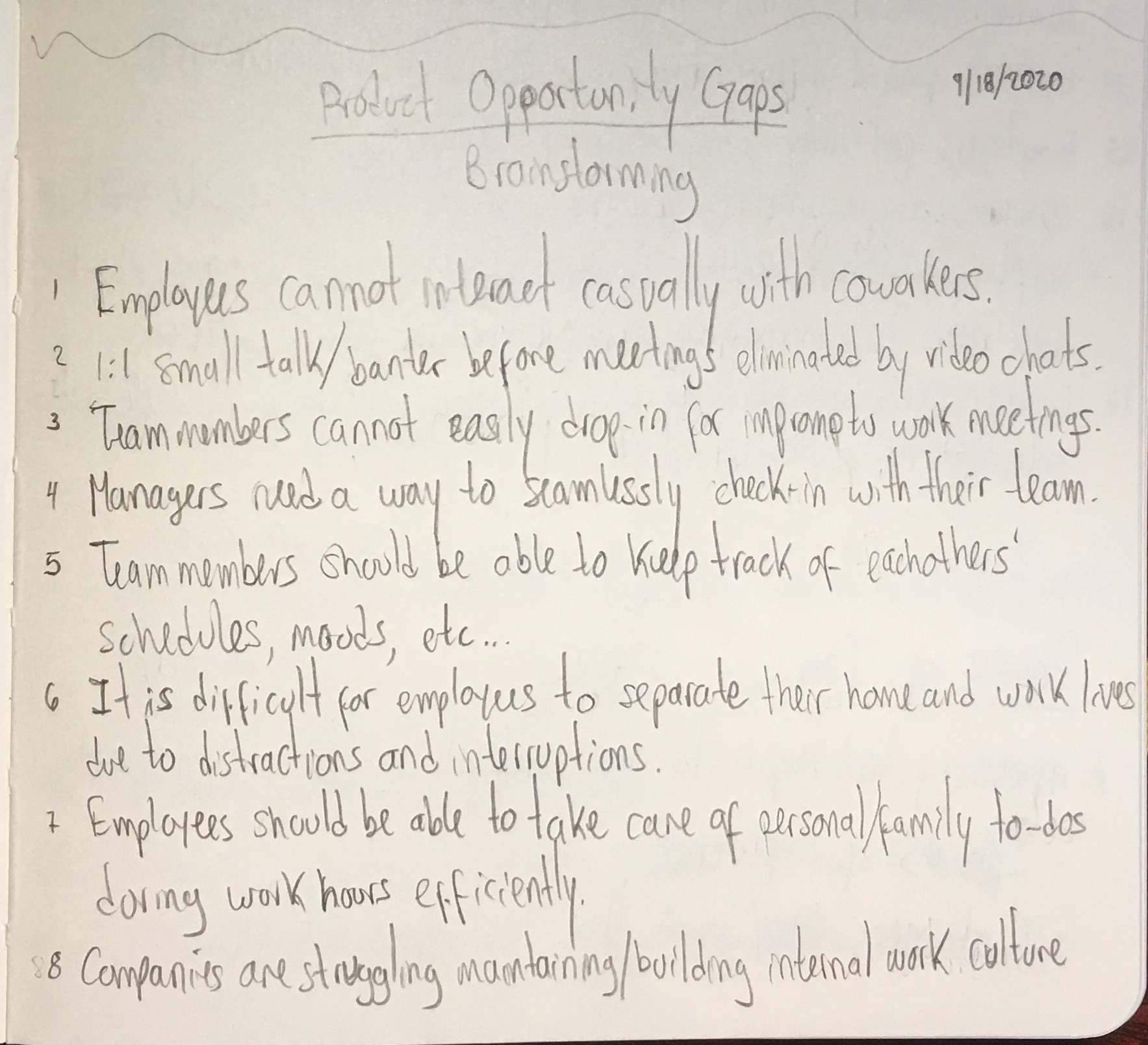
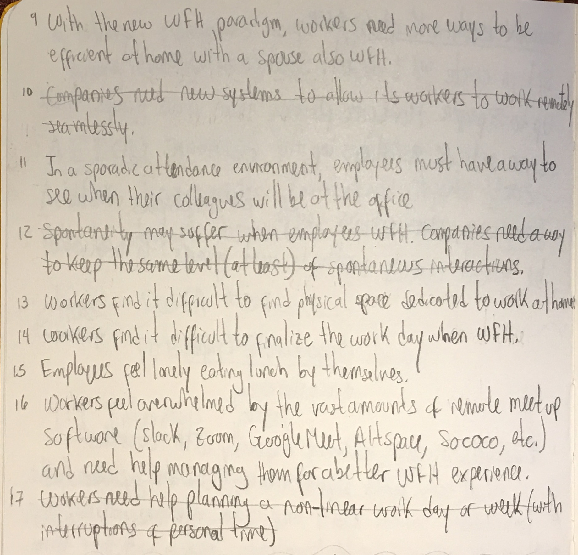
My POG ideas were combined with the other team members’ and we realized through various rounds of affinity maps that working with broad themes was more manageable, rather than working with singleton ideas.
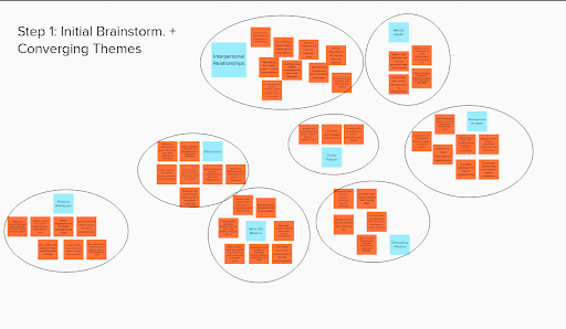
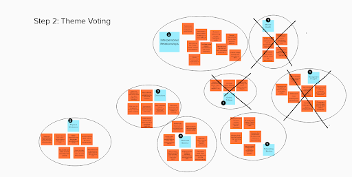
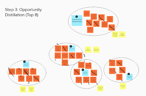
Top POG themes:
- Friendships with coworkers
- Dependent distractions
- At-home work privacy
- Improving desk layouts
I decided to generate additional POG ideas around the dependent distractions theme based on my 1:1 interview with my uncle.
However, due to the level of potential user impact and feasibility of design, the team decided to pursue the improving desk layouts theme…
…and we’ve now made it to the starting point of almost every other team!!
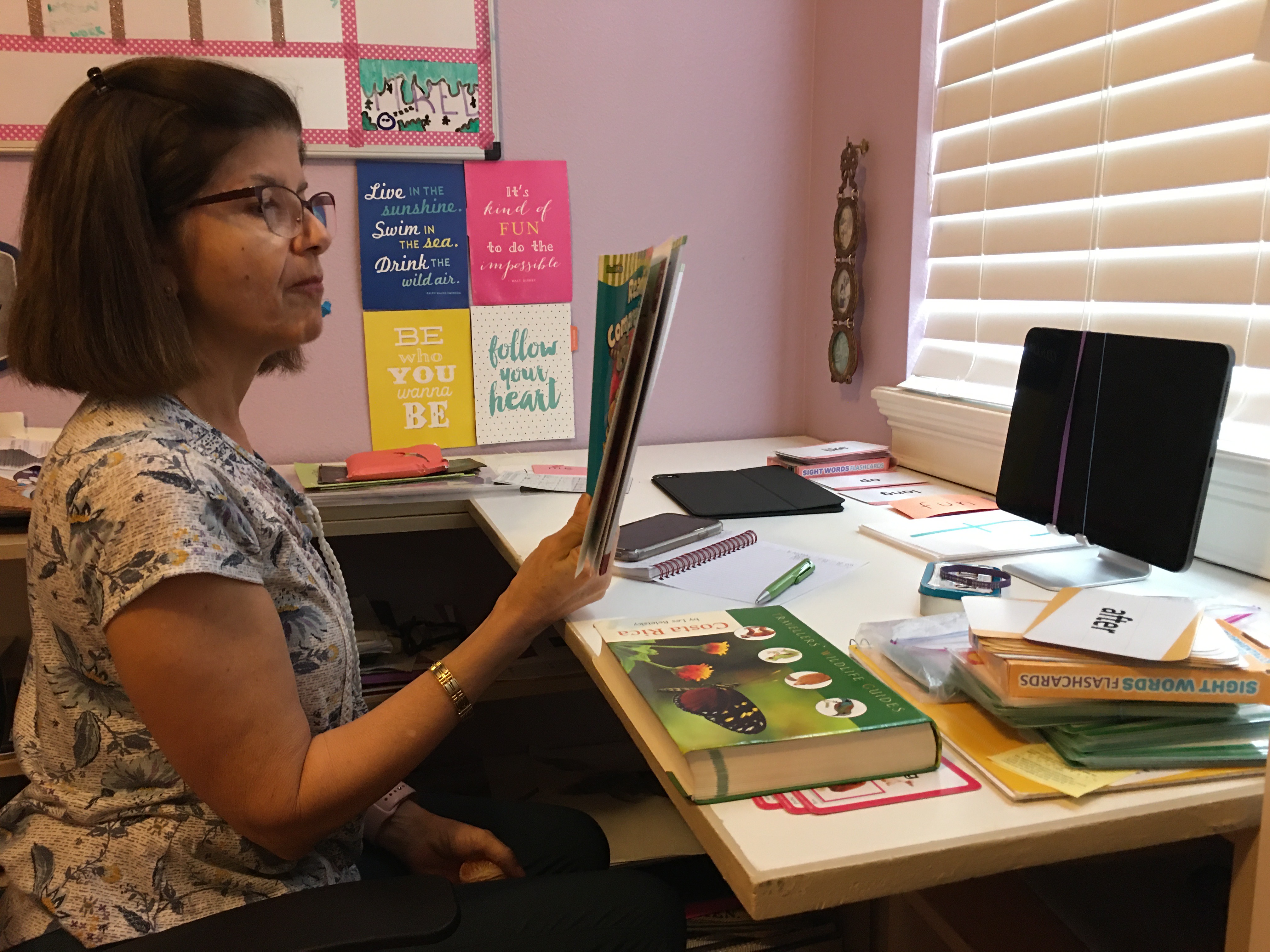
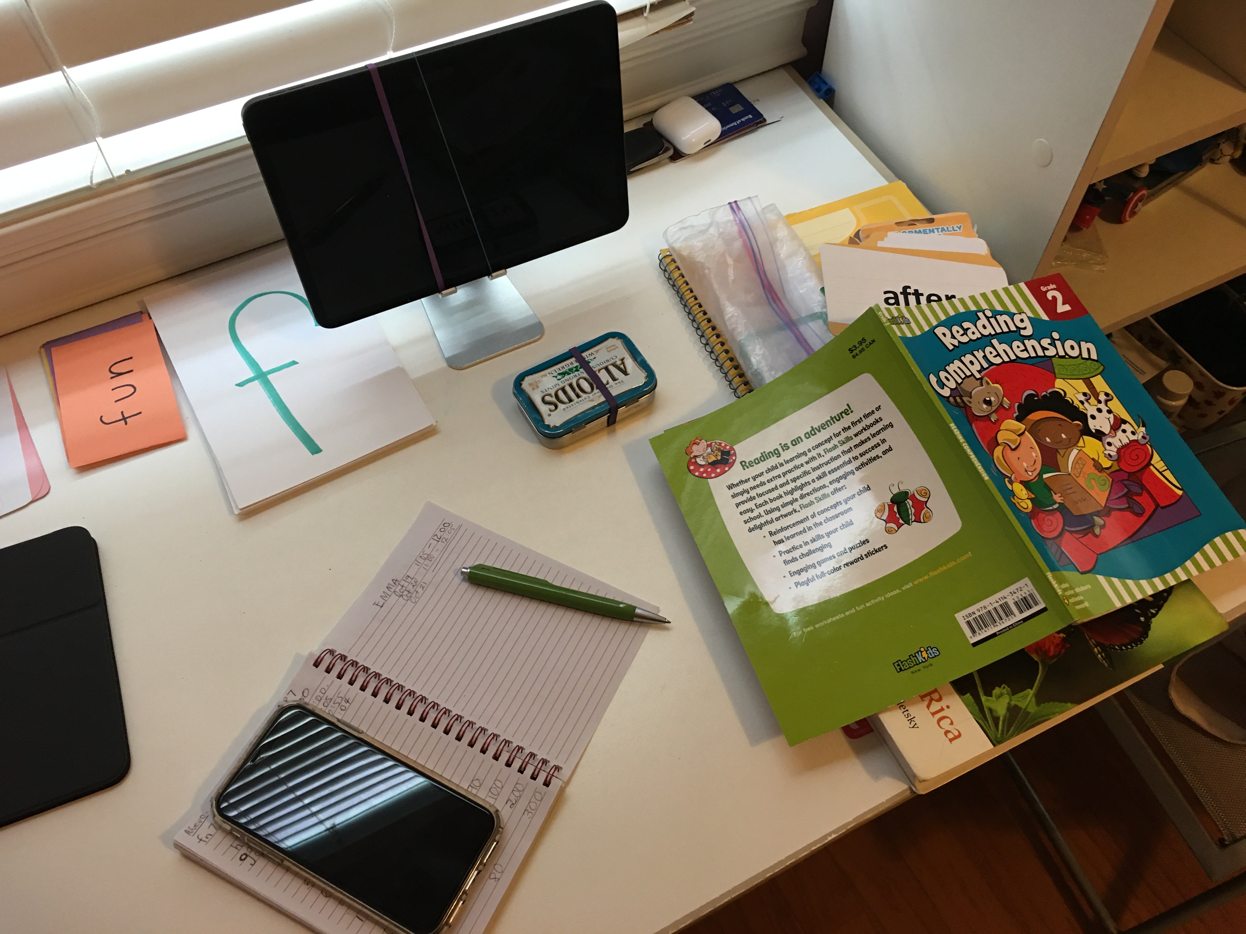
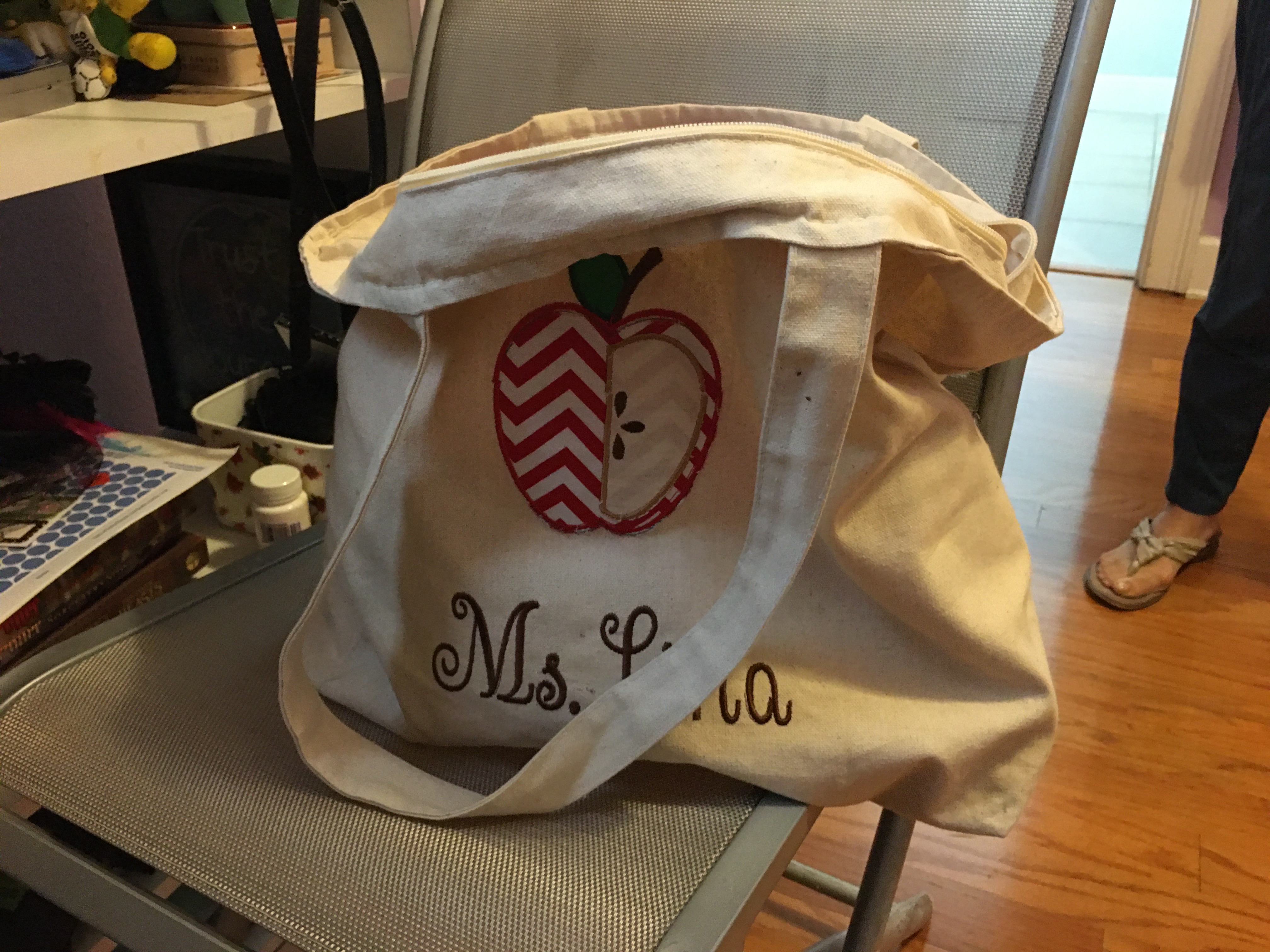
I decided to gain some perspective within this theme by interviewing my Mom. She is a retired Montessori school teacher, and she currently tutors two young kids on their reading. Although her sessions are in a remote setting, she still has to carry around a large purse full of teaching material.
Next, it was time to come up with a set of screener questions and interview questions to gather real user data. Deborani was gracious enough to setup 30 anonymous interviews on usertesting.com with HP’s corporate account.
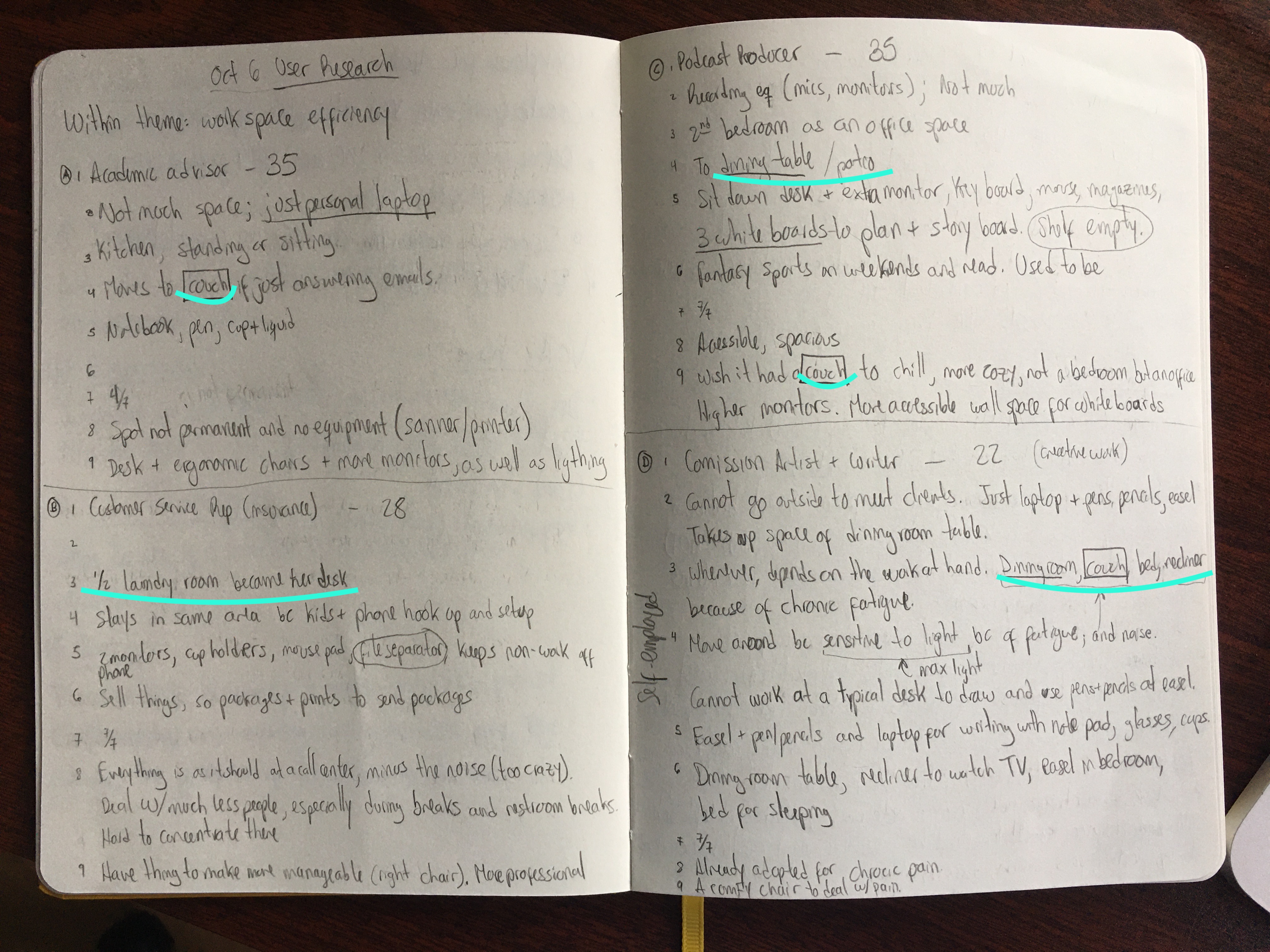
User data came in 2 waves. The first round of 15 interviews explored the theme around Improving desk layouts. A glaring pattern surfaced across 3 of the 4 interviews I summarized: people love working in different locations around their homes during their work day! This was true even if they gave their main WFH setup a satisfaction score of 7/7.
Due to their high satisfaction with their work setup, wherever they choose to work, and their propensity to move, we wanted to learn more about their relocation experience. Taking keywords from the interviews, the team was ready to define the POG:
People are seeking portable work-from-home setups that do not compromise on comfort.


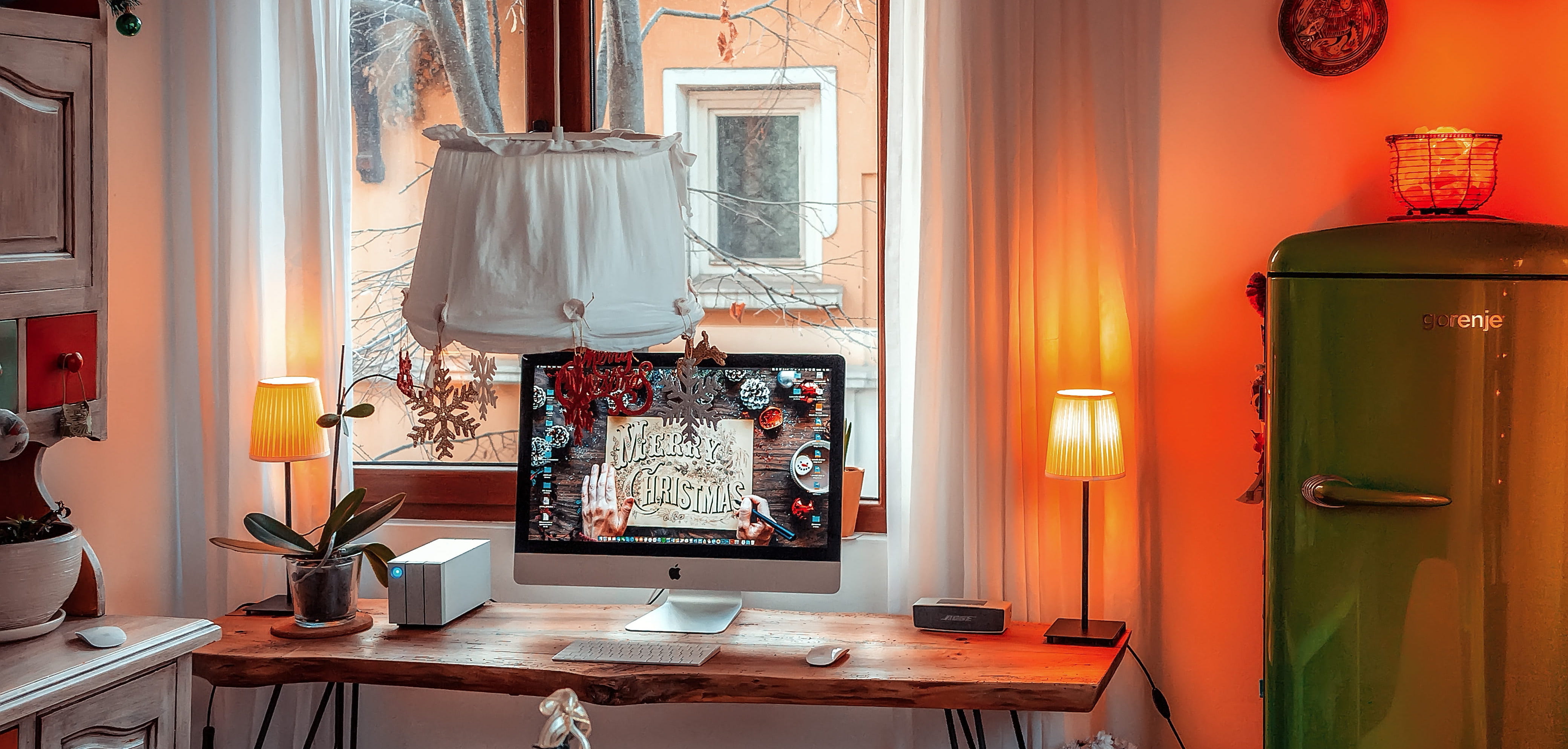
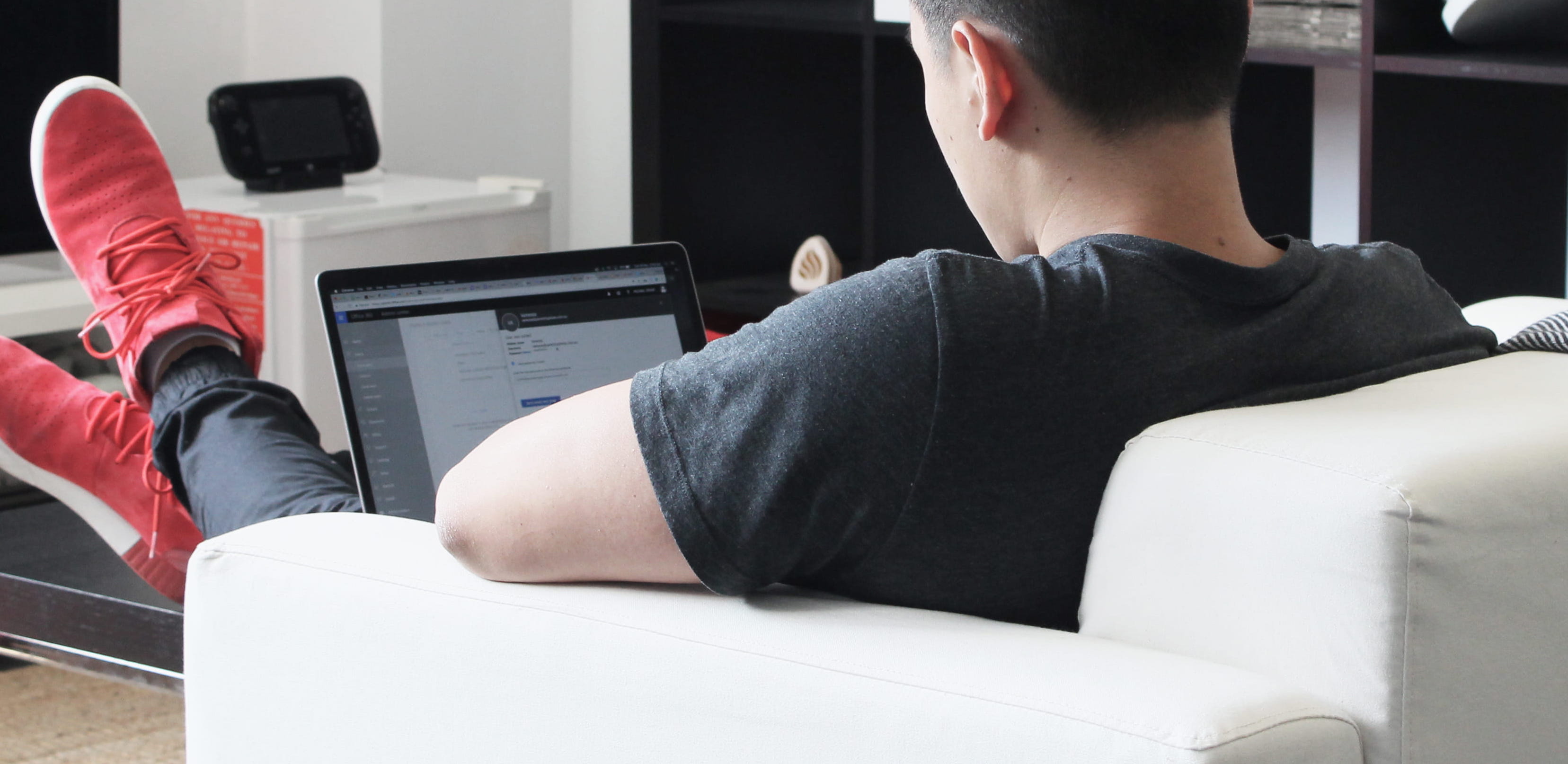
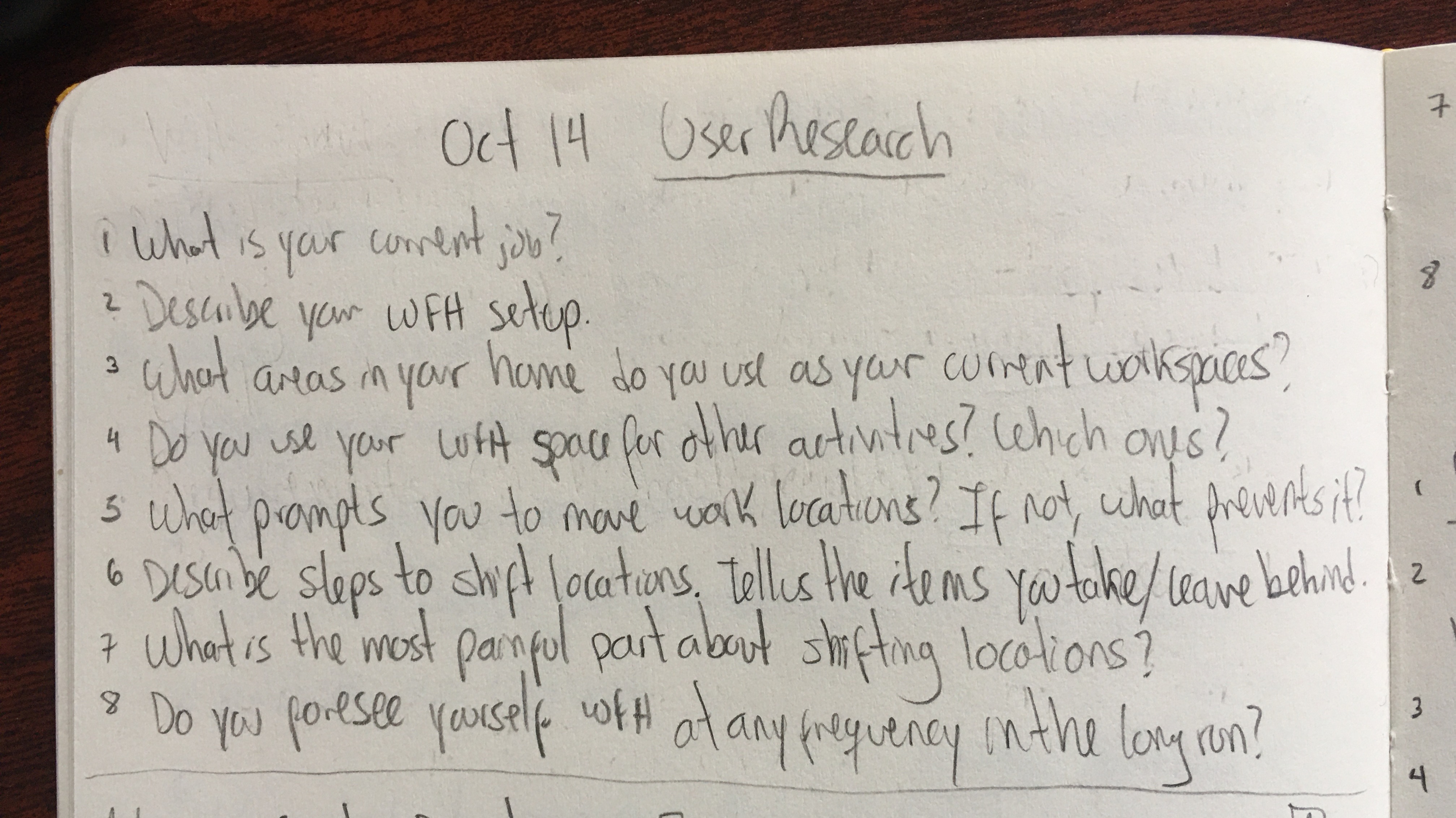
The second round of interviews focused on people’s experiences while relocating their work area and to get a sense for the types of places people chose to work at. These questions used the why-how laddering method to dig deeper into an experience with a why-styled question and broadening the conversation with how-styled questions.
I listened to 10 interviews and I summarized their responses. I was astounded to hear about the gymnastics workers must perform at home to be successful at their jobs!
A customer service representative converted half of their laundry room in their basement into her office.
A commission artist and writer bounces from their dining room table to their couch to their bed to their recliner and back to chase the sunlight and cope with chronic fatigue.
A therapist+parent has to flee in panic mid-session to a different room to protect their clients’ privacy when her family gets home.
A creative director permanently works at their kitchen table, where their baby gets fed three times a day.
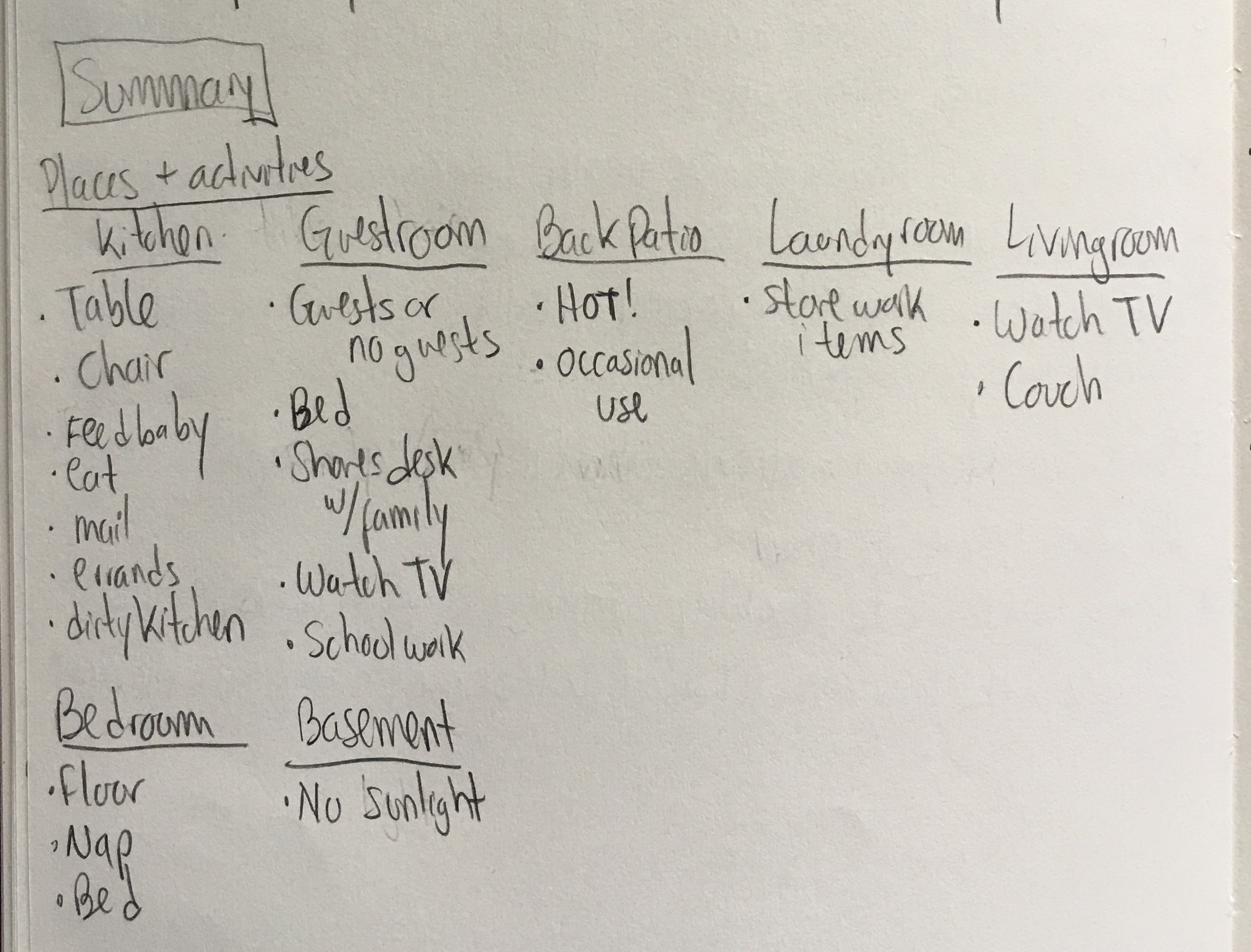
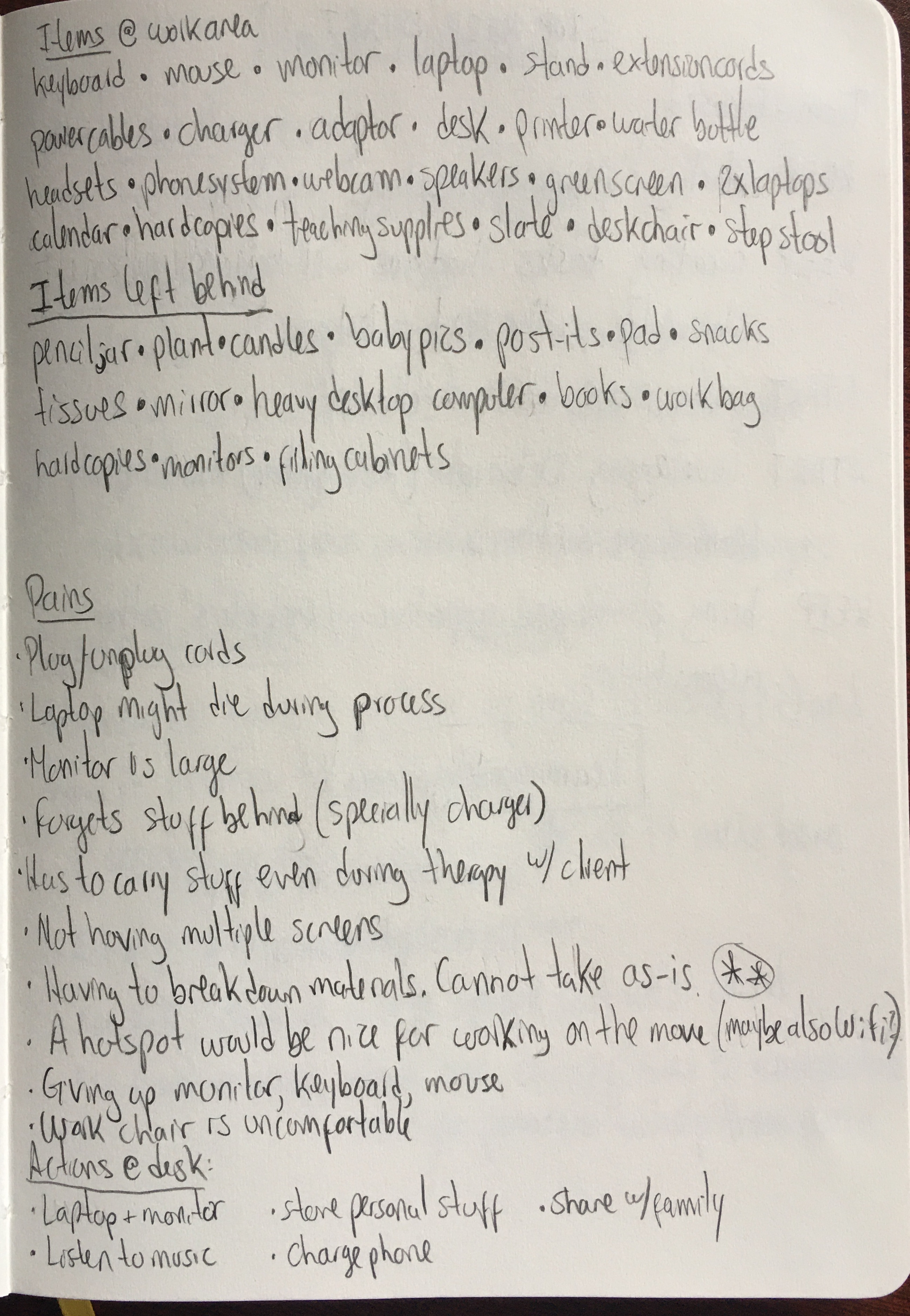
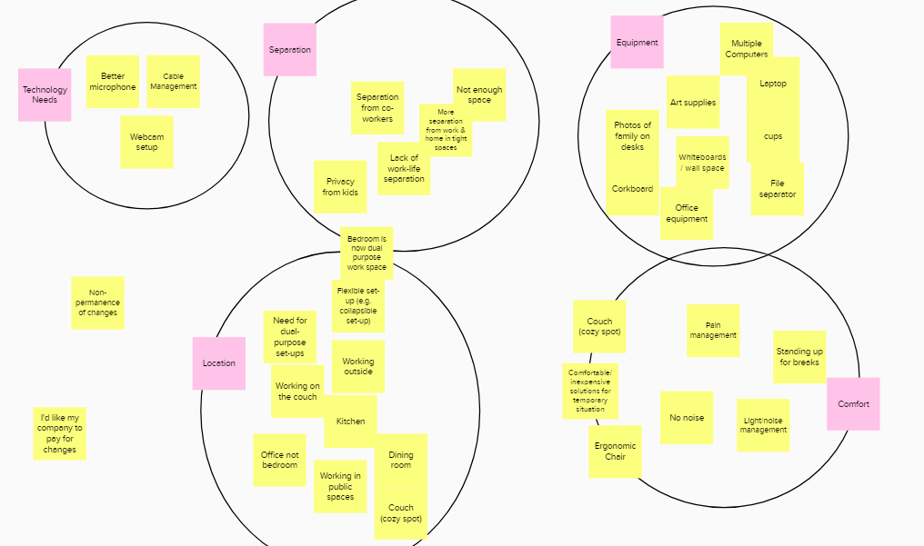
Open card sorting time! Using Mural, the team modified this method where we silently created the categories ourselves based on common keywords across sets of user data.
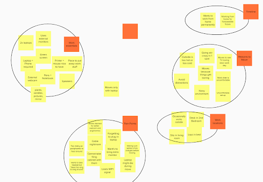
Guided by my interview summary and by group discussions, we realized that people want to relocate work setups quickly with as many items as possible, and still feel continuity between locations. I was fine with this conclusion: I normally work at a different location around my home every single day, so the interviewees’ pain points are my pain points as well. I can totally relate.
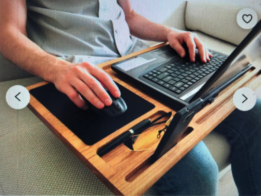
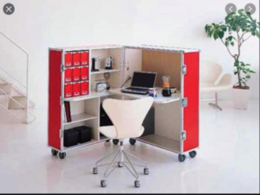
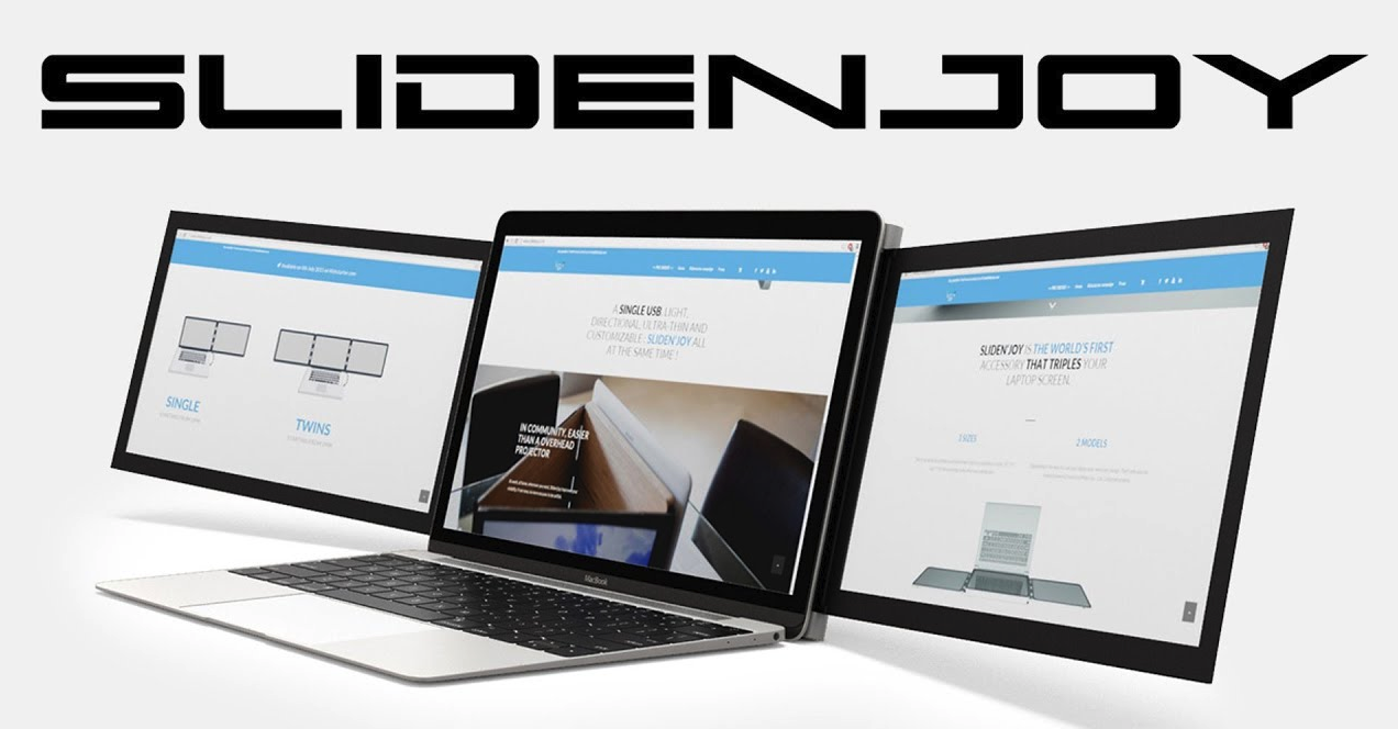
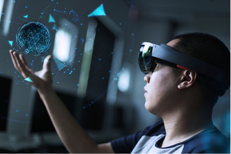
These competitors demonstrate a wide variety of solutions for addressing our POG. I made sure to include Microsoft’s HoloLens 2 in the mix because of my familiarity with the product; my wife is bringing the HoloLens as a remote inspection tool into the chemical plant where she currently works. A 2x2x2 matrix helped us position these competitors to exploit wide-open spaces with our eventual solutions.
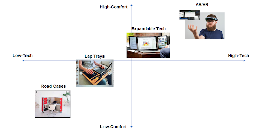
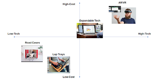
A value opportunity analysis (VOA) put the competitors in evidence against our POG and became benchmarks for how our product would add value to our potential users. Interestingly, note how high-tech competitors directly solve attributes associated with mobility and comfort: adventure, independence, security, confidence, power, and ease of use. At this point in time I had a premonition about using high-tech solutions for solving our POG.
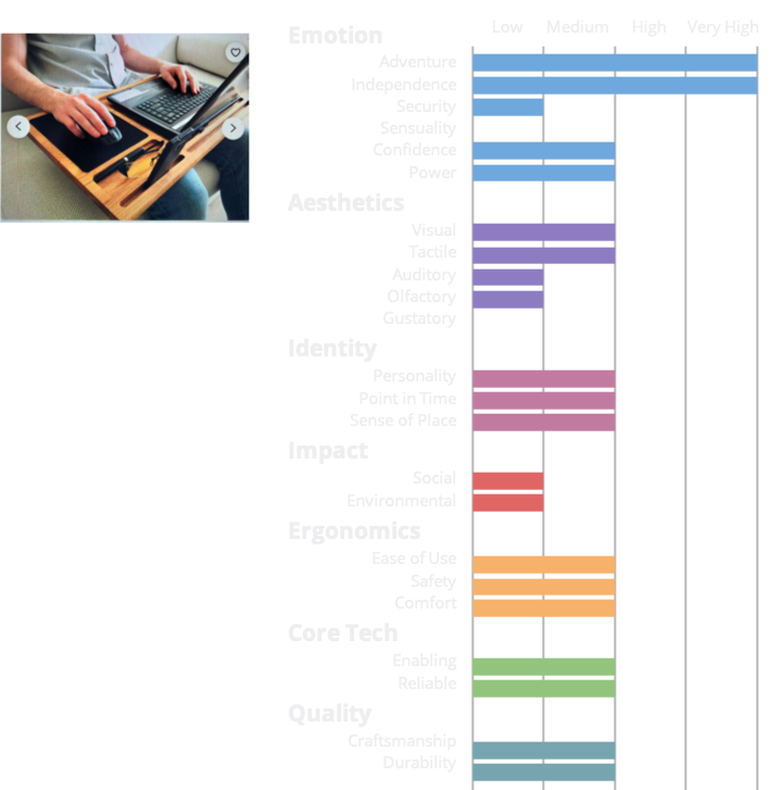
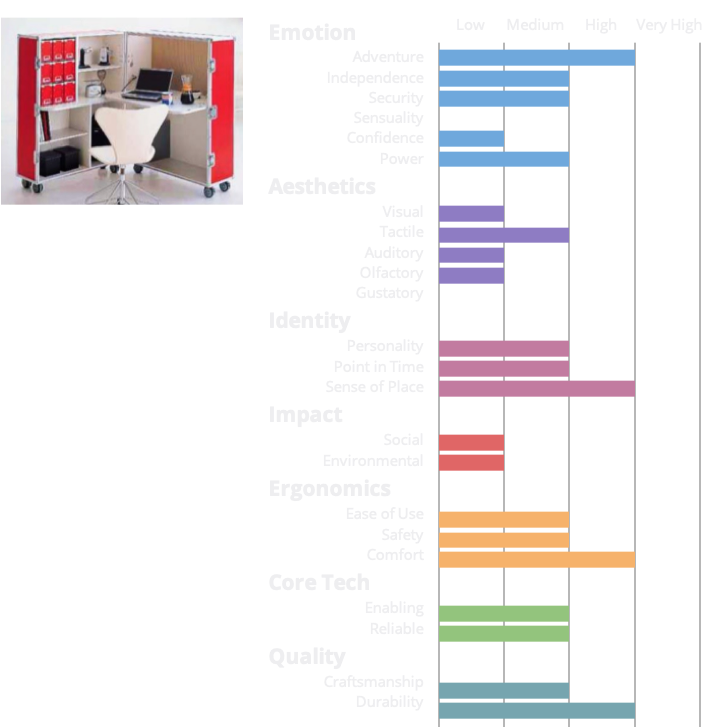
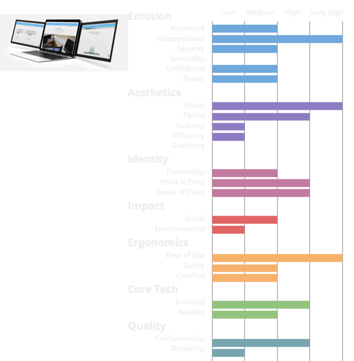
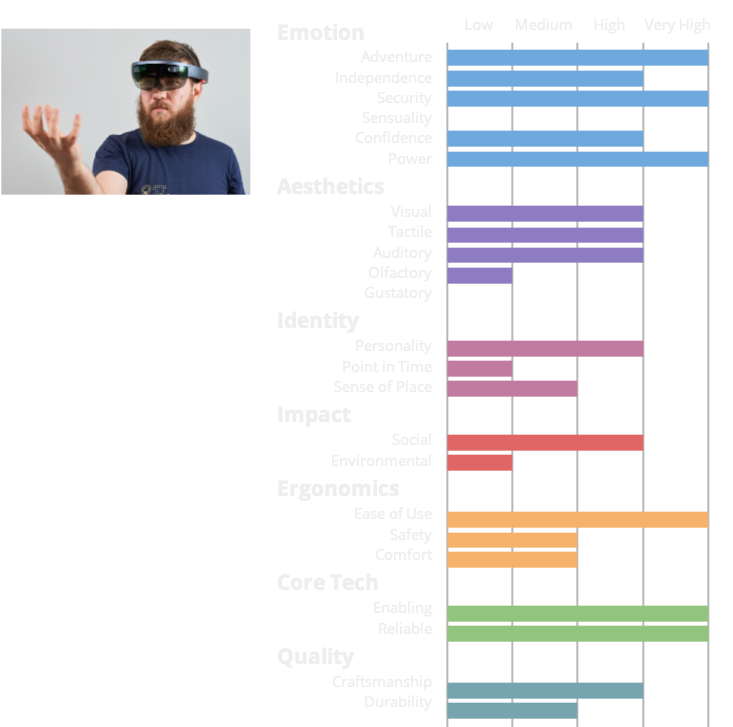
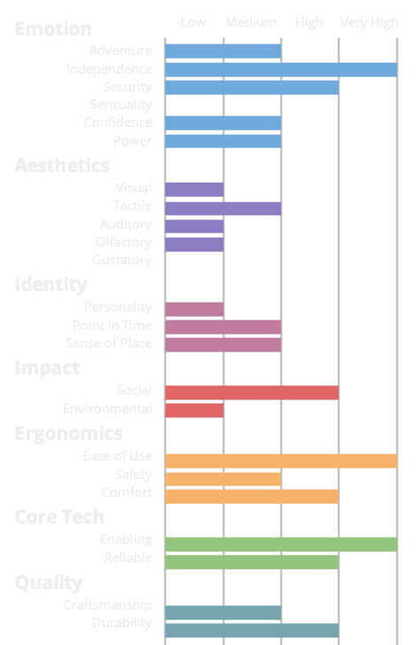
Granting painless mobility to home workers, both during tear down & setup activities and in preserving the continuity of their work, is evident in our product VOA. It is also tied to user pain points and motivations.
Independence | “If there are absolutely no restrictions, I would move my entire… workspace into a private area that way I could sit instead of be on the floor.”
Must have a way of powering external devices (phones, laptops, monitors).
Ease of Use | “I’m pregnant… [and] I have to take the charger with me, which isn’t nice to bend under the desk to get the charger out. I always forget it wherever it was. And I don’t have it when I need it… so I do think that the charger part is one of the most painful parts just because it’s never just a quick plug it in and good to go… it’s never on the top of my mind when I’m shifting locations.”
Must be able to be carried easily by an average adult.
Must be intuitive for the user such that they don’t have think about everything involved.
Social | “Work stuff starts intermingling with personal stuff.”
Must be able to be fully packed up and moved within 2 minutes.
Could have a system to cancel out noise from non work-related distractions.
Comfort | “A little stand for my laptop… puts it at eye level for me, which is really nice… but I’m currently actually on my couch… because my desk chair isn’t really comfortable. I got it more for looks rather than sitting.”
Must be designed in such a way to encourage proper ergonomic use.
Should have no uncomfortable surfaces that are touched frequently.
Could be adjustable to provide ergonomic support.
Our product requirements also took shape for all VOA attributes. All must requirements had to be met so that our solution does not lose its purpose, all should requirements indirectly helped us enhance useful features, and all could requirements became stretch goals, but would not detract if absent.
These product requirements gave us carte blanche to turn the corner and start generating some concepts!
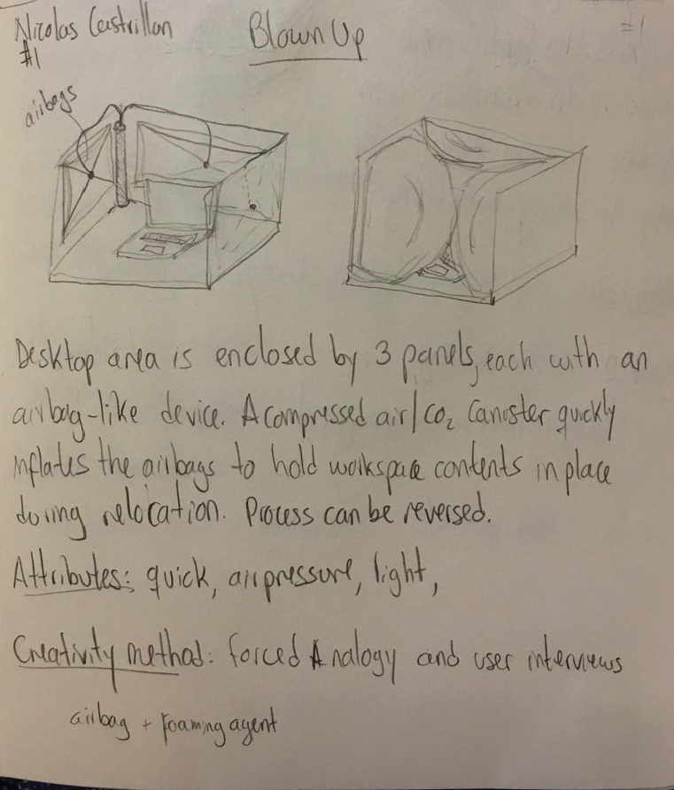
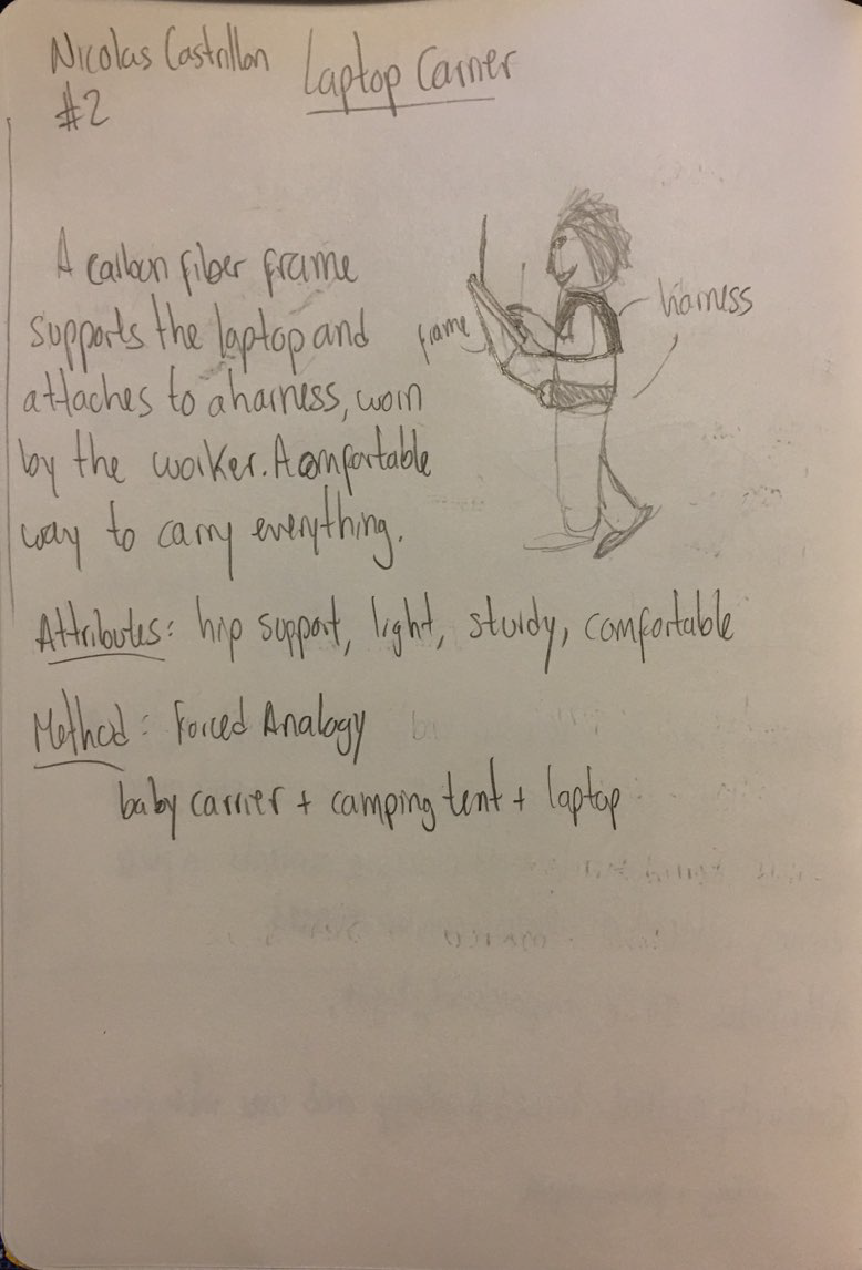
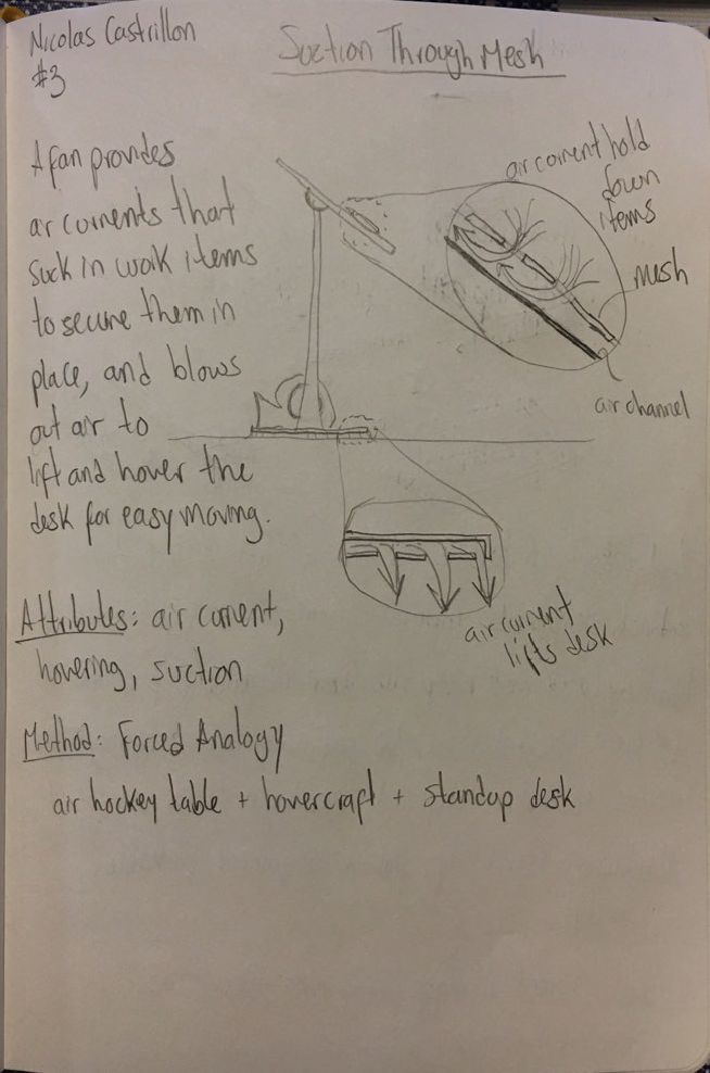
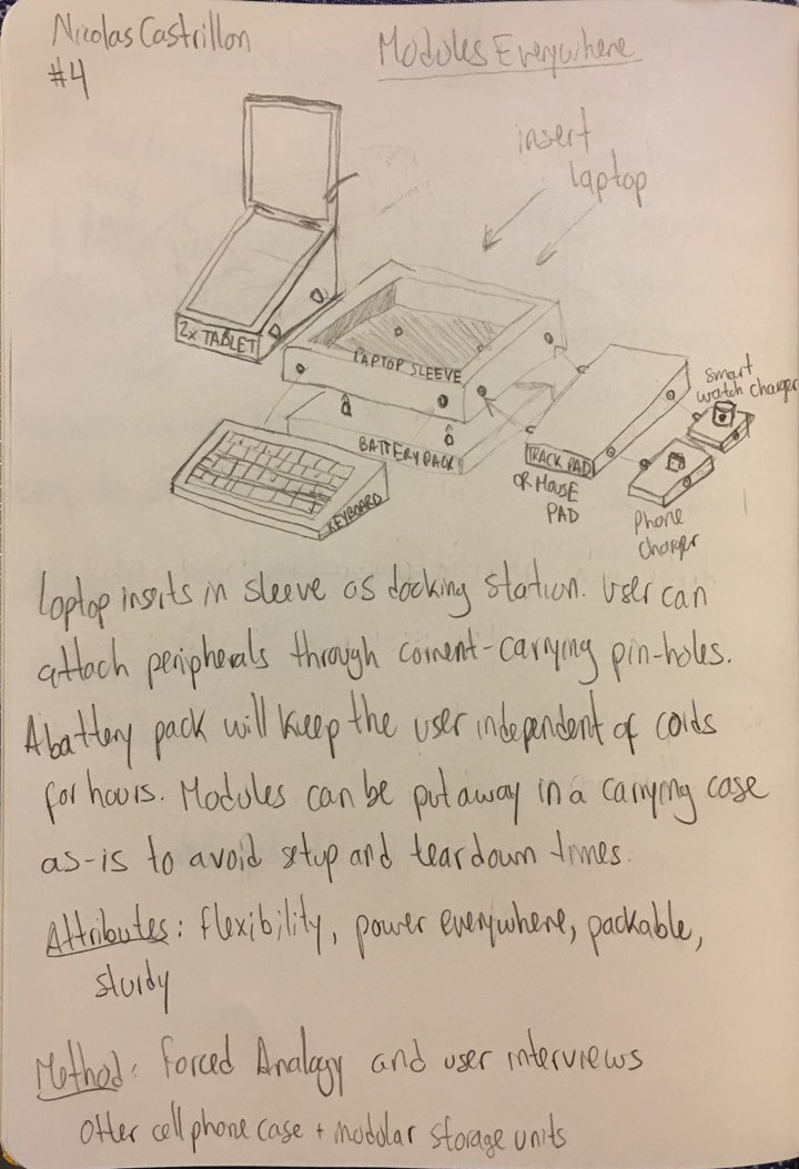
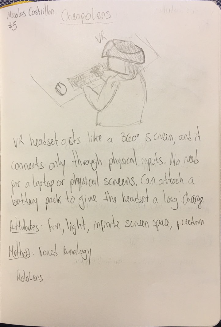
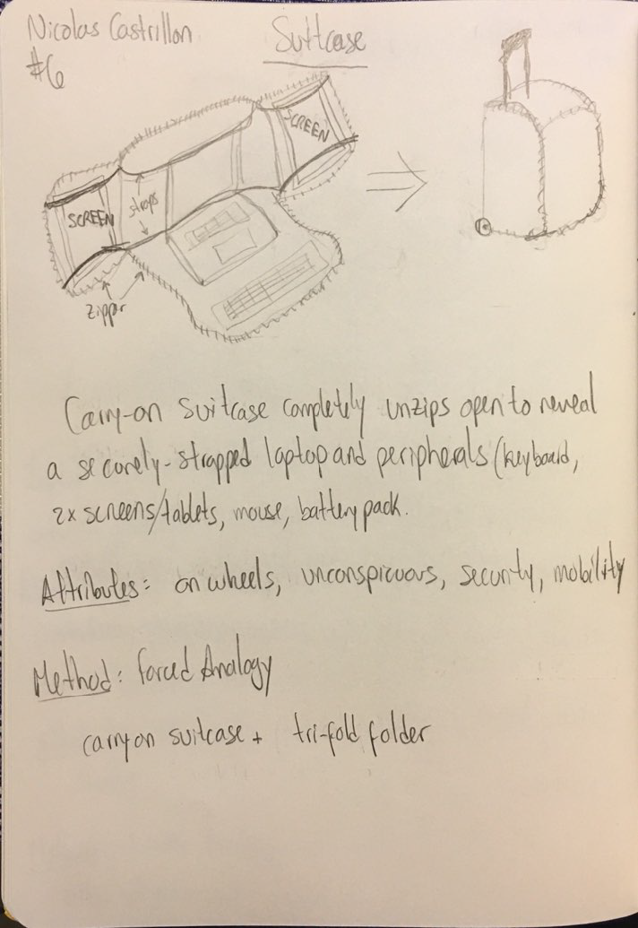
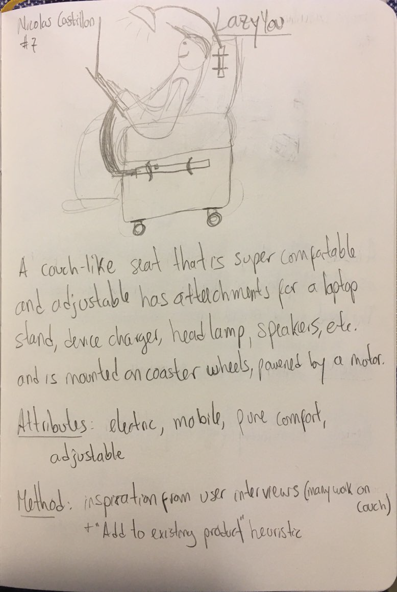
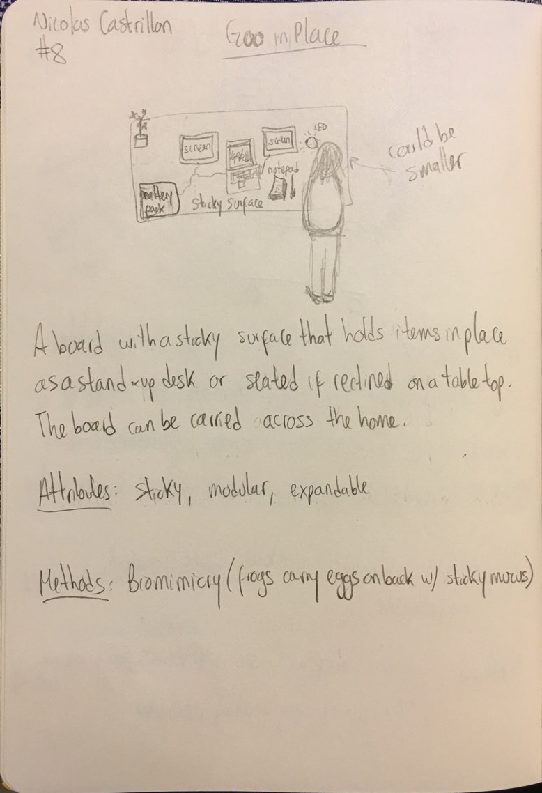
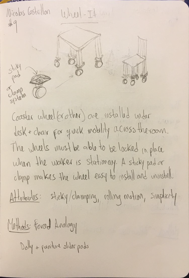
I drew lots of inspiration from a variety of sources. Most naturally (for me at least) were leveraging user motivations + pain points to mashup everyday items via the forced analogy creativity method. Idea #2, the Laptop Carrier, was created when a baby carrier + camping tent poles merged together for a sturdy way to work on the go between work locations.
Additionally, I used biomimicry to draw from how a mother frog carries her eggs on her back, similar to how the sticky wall is able to hold tablet or monitors in place in idea #8, Goo on Place.
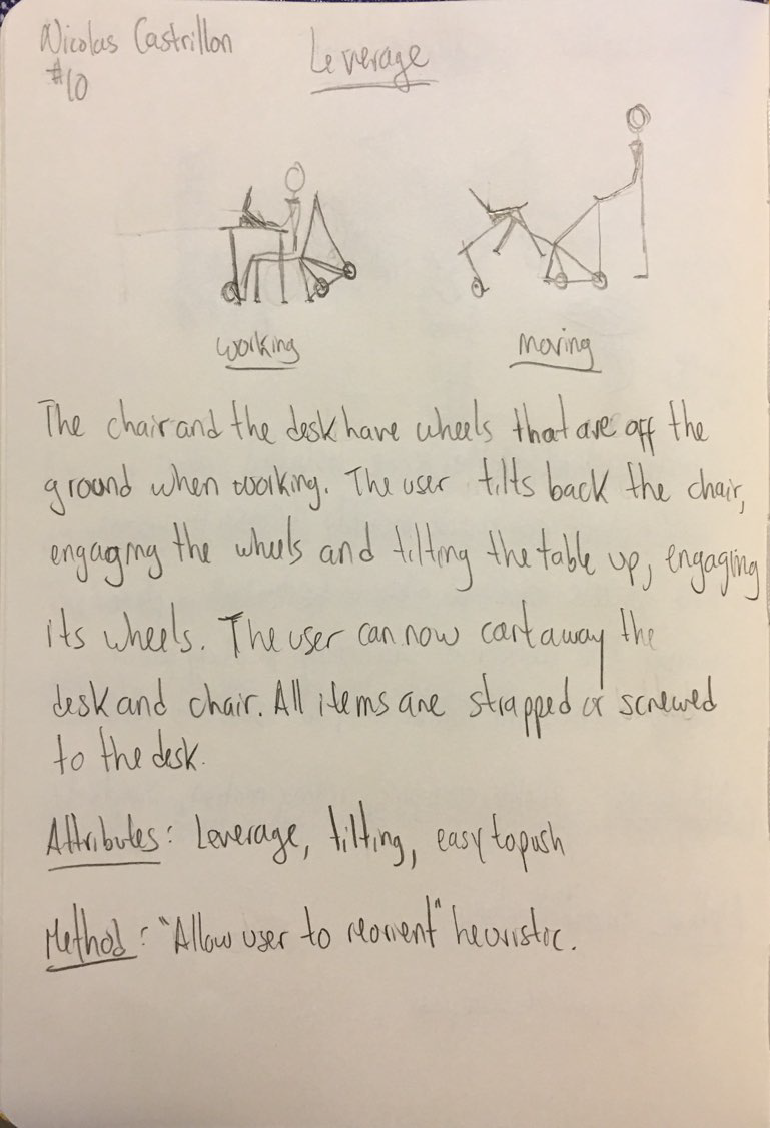
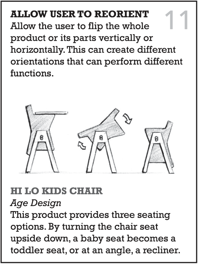
However, using design heuristics cards really expanded my creativity with interesting prompts; it squeezed out ideas from a dried-out brain. Idea #10, Leverage, came out from the allow user to reorient heuristic, which challenged me to think of ways to reorient a desk+chair for enabling mobility.
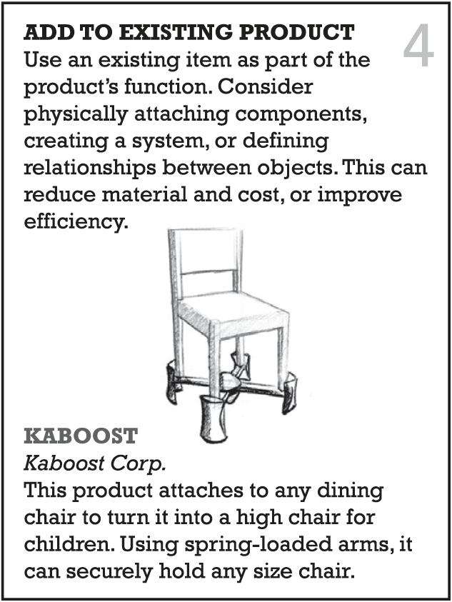
The team also practiced 4-3-5 brainwriting to develop our collected concept ideas and explore more of the design space. This creativity method was TOUGH! Coming up with 3 new ideas, although inspired by existing ones, in just 5 minutes was totally uncalled for. There were many, many bad ideas that came out from there, but these failures helped us create boundaries and keep-out areas in the design space.
About 81 concepts were generated by the team!! After a lot of veto voting and team discussions, we were left with a final set of 14 concepts, 3 of which were based on my concepts.

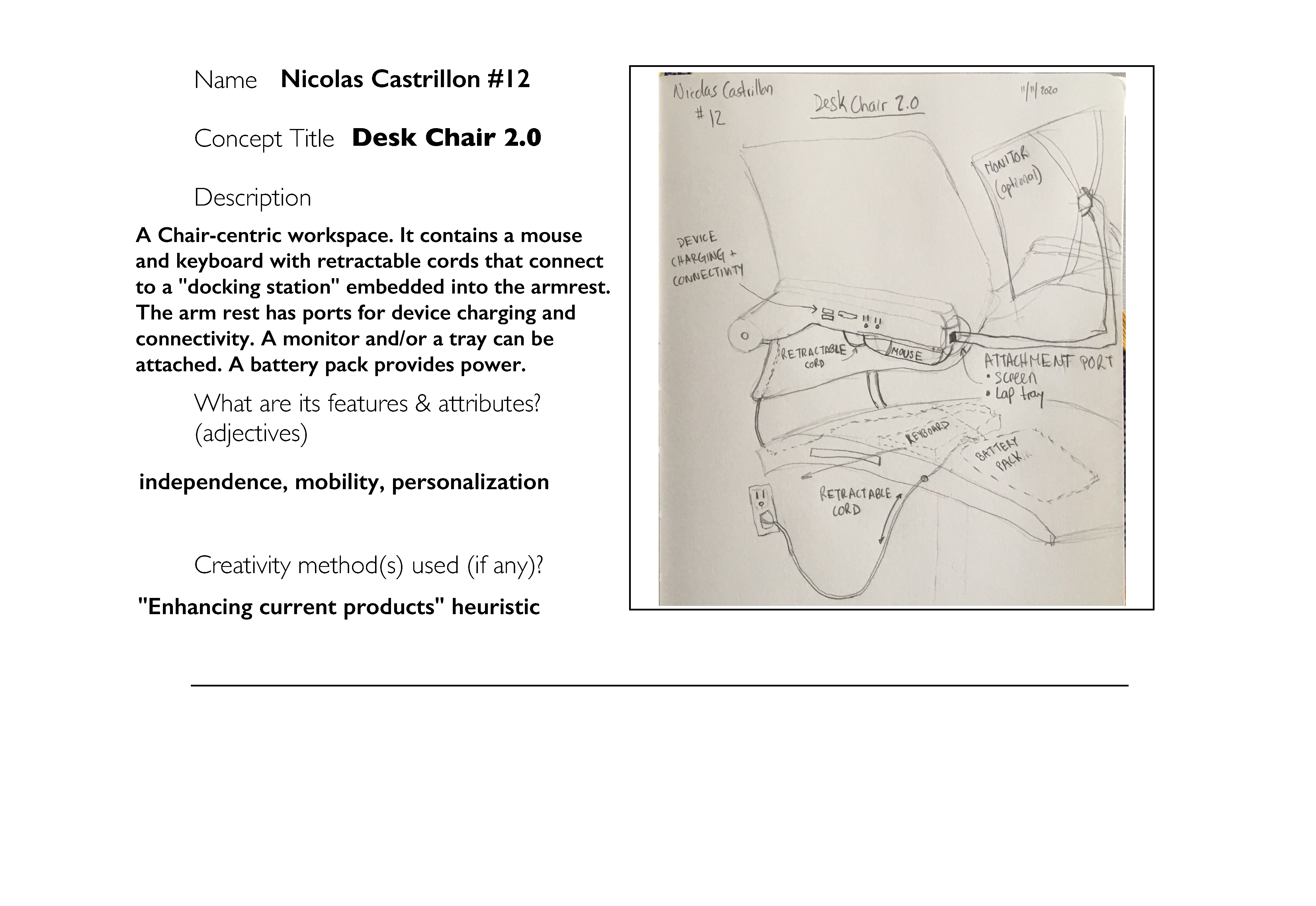
These 14 concepts were rated in a weighted matrix with the lap tray competitor product as our datum, due to its simplicity. As a summary of the results, Central Computing received 23 points, AR Office 18, and Sticky Screens 17. The next ranked concept received a score of 4 and the worst two a -18!! Our top concepts had emerged.
What’s better, a positioning map let us rest assured: the concepts mainly represented options with medium to high mobility and spanned the technology complexity spectrum.
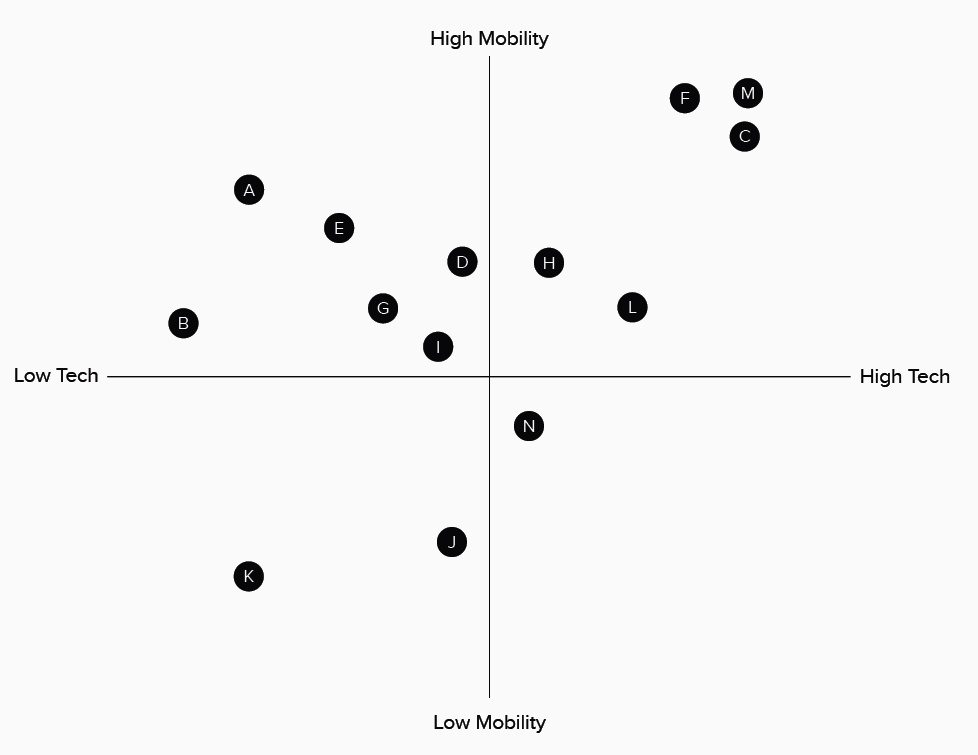
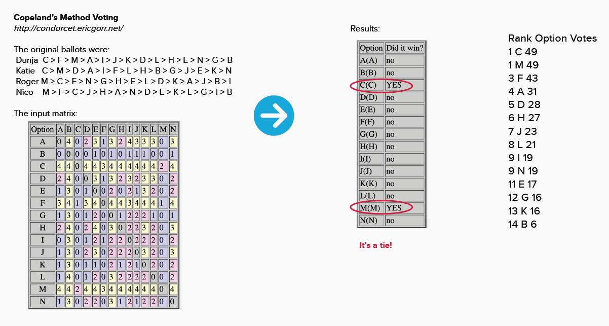
Finally, I asked the team to individually rank the final 14 ideas based on the weighted matrix, the positioning map, and our lengthy discussions about each concept’s merits and detractors. I used a pair-wise Copeland’s voting method calculator to pragmatically compound a final ranking that considered everyone’s preferences.
… but against all odds, there was a tie!
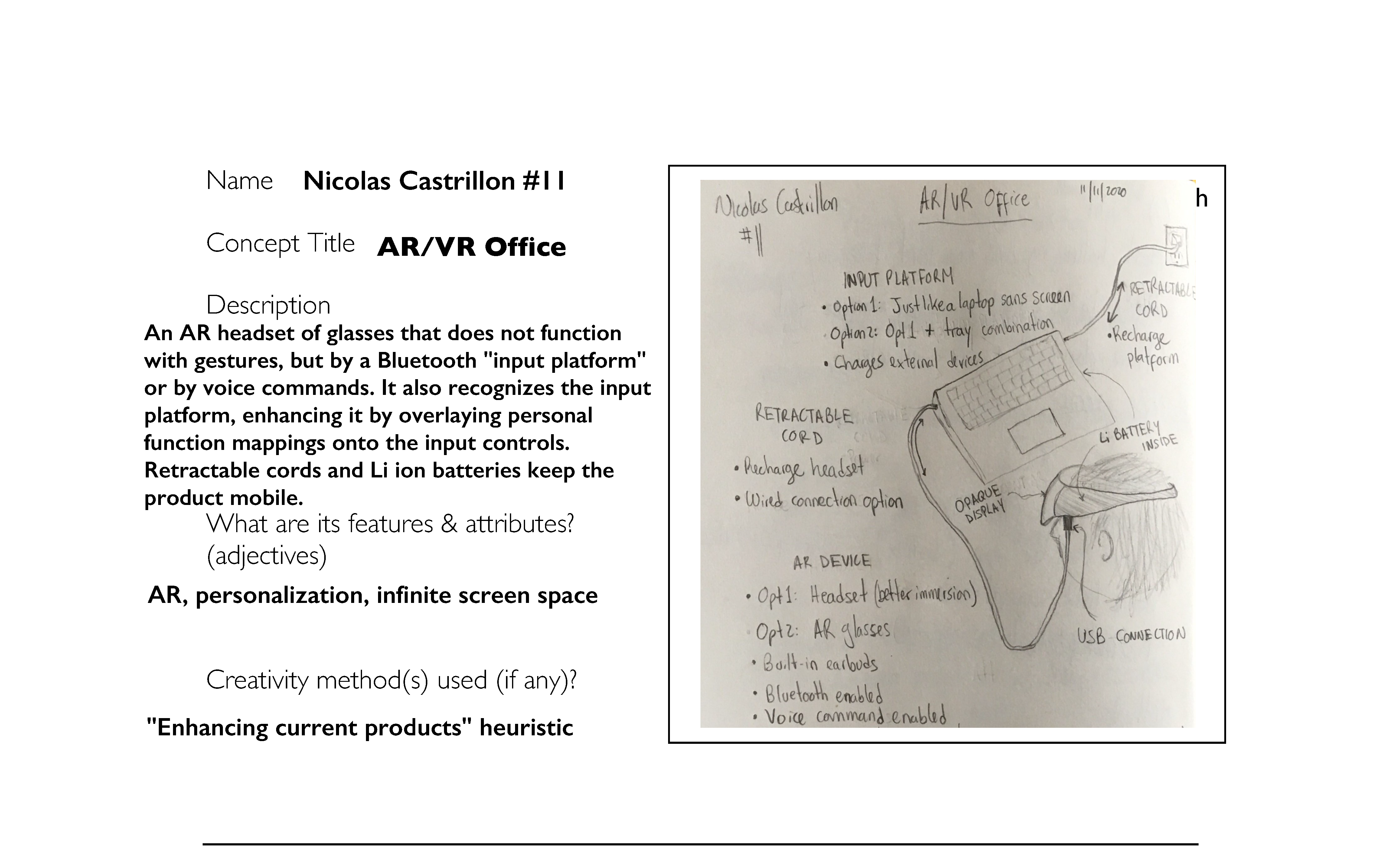
AR Office (M) | A combined mouse, keyboard, and headset solution that would provide users with access to windows/files through an augmented reality (AR) headset. Users would be able to put on the headset and work by manipulating windows that are seemingly floating in their field of view. The user would essentially have a 3D, 360-degree screen space.
Central Computing (C) | A platform that would allow users to access their desktop from any screen inside or outside their home. The platform would also provide users with access to any open browser tabs, windows, or applications so that they have continuity of their work across any location.
Note that both of these concepts mean developing high-tech, high-mobility solutions to our POG.
In the end, we decided as a team on moving forward with my AR Office idea.
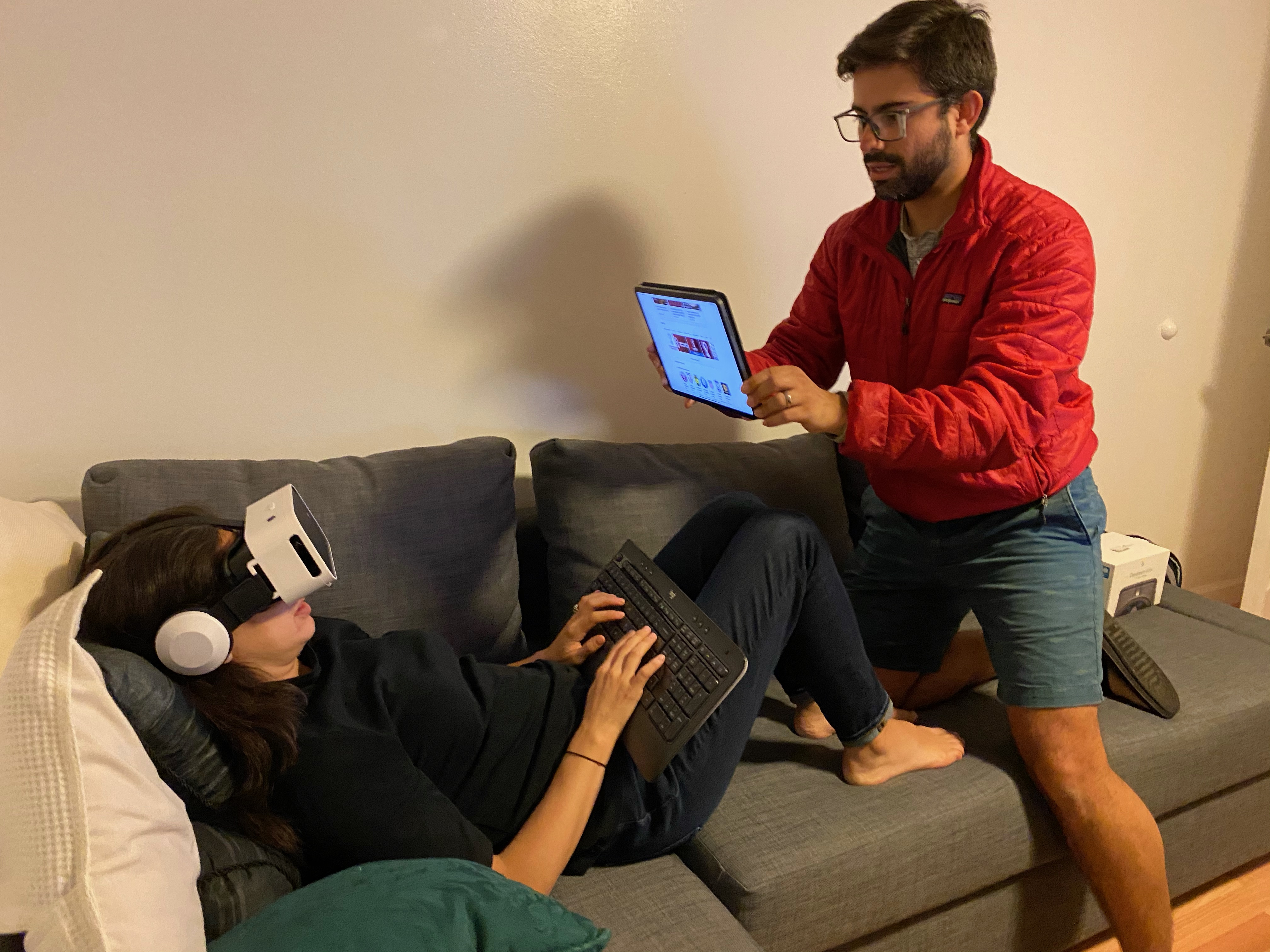
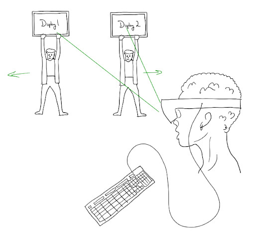
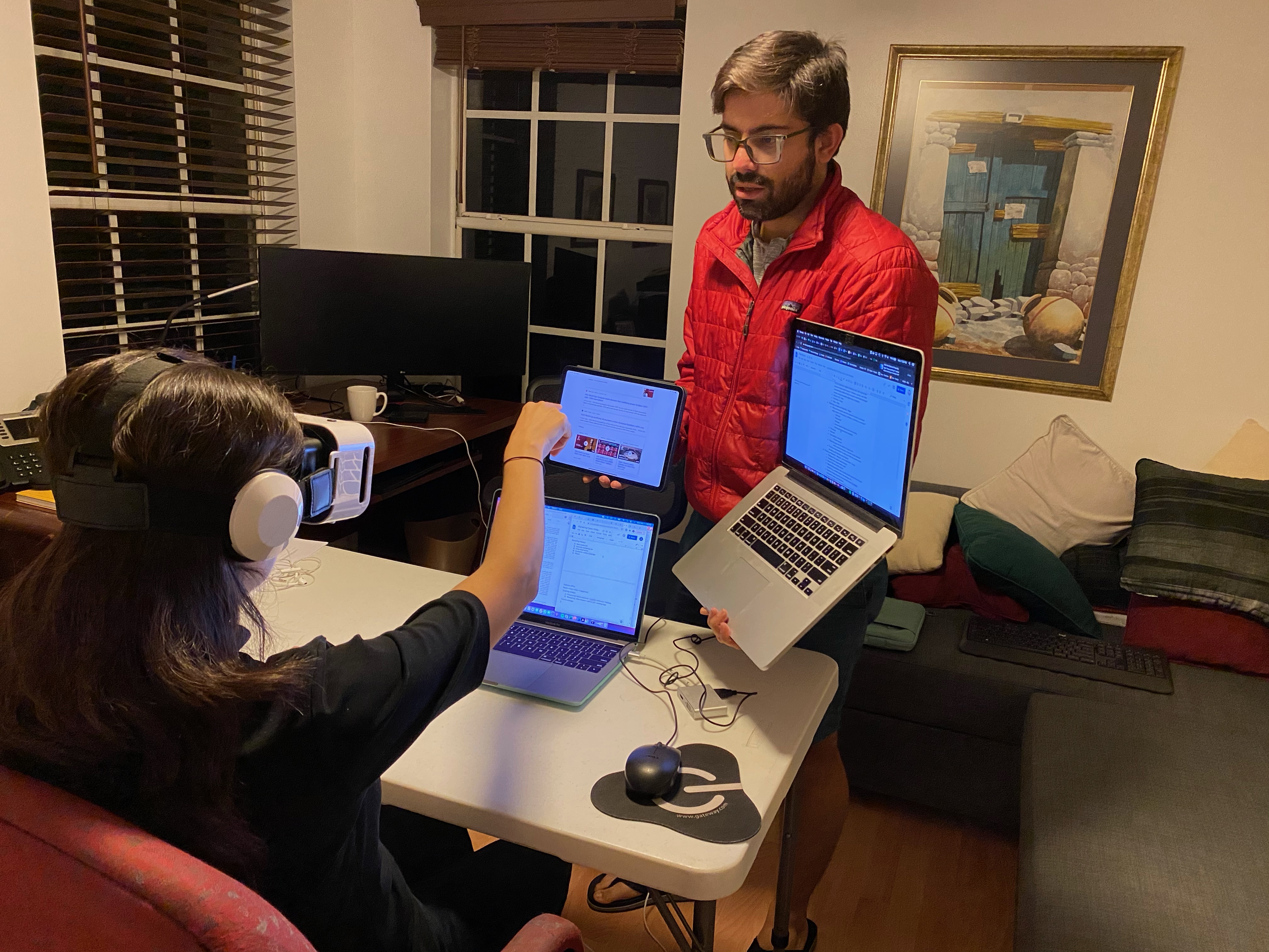
The best way to flesh out the concept was to create a Wizard of Oz prototype: I gave a representative headset to my wife and held up tablet and laptop screens for her to “manipulate” as she followed a set of instructions. Doing this will allowed the team to get feedback on how this device would function during users’ work tasks and during a relocation event. The prototype also addressed two of the most important aspects of our POG: comfort and portability.
Setting up this prototype took me about 1 hour to develop a script and 10 minutes to setup. All I needed was a cheap$13 VR headset and a set of devices with screen that I could manipulate! So simple.
I was able to guide my wife though great insights (thank you Cosis!), such as how she would scroll to bring virtual windows closer/farther and how she would use a button on the headset to pause & minimize her windows while she relocated.
The Wizard of Oz prototype uncovered specific mechanics of use of the AR Office concept that proved to make a lot of sense to potential users.
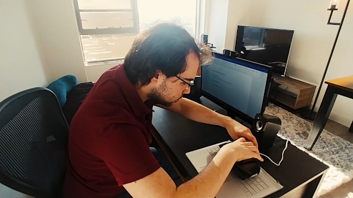
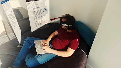
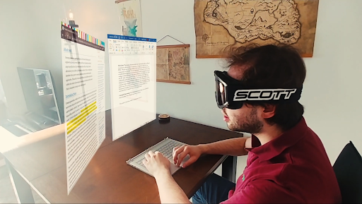
The team decided to use the Jacobs Design Showcase as an opportunity to gauge interest with a wider set of potential users. Reactions to our product during the showcase would offer valuable insight into how our target market might respond to the product.
Feedback to our video was overwhelmingly positive - with a number of attendees saying they wished the product existed. Additionally, the class voted to award our team with the Most Innovative Product award!


